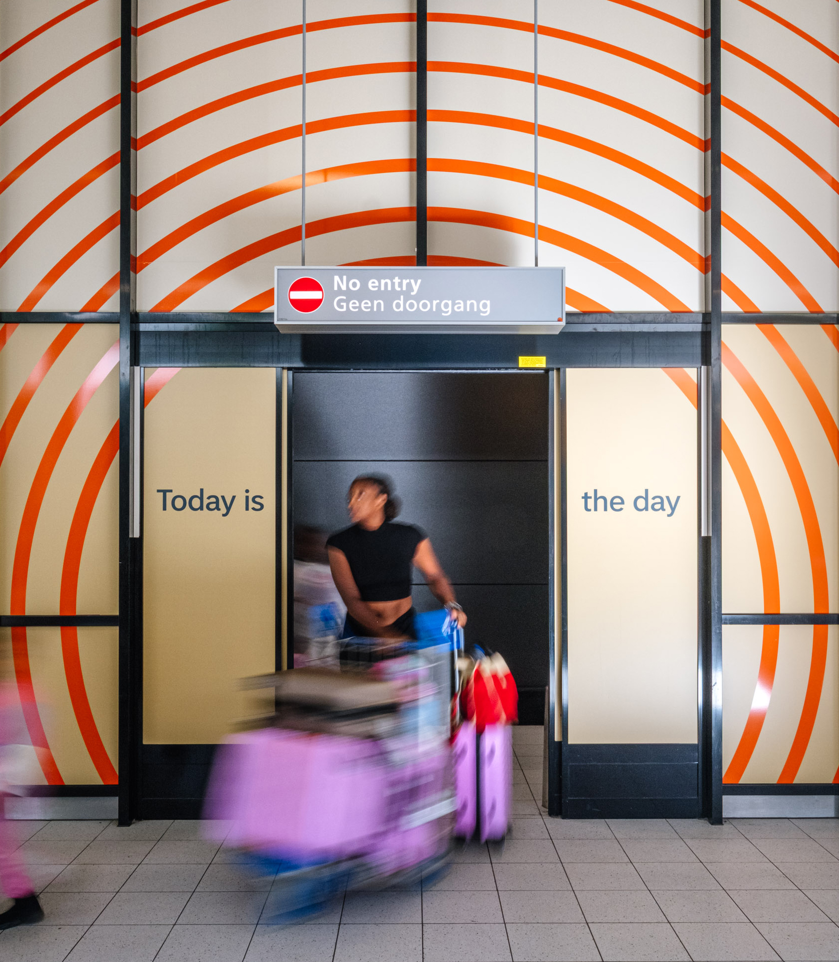
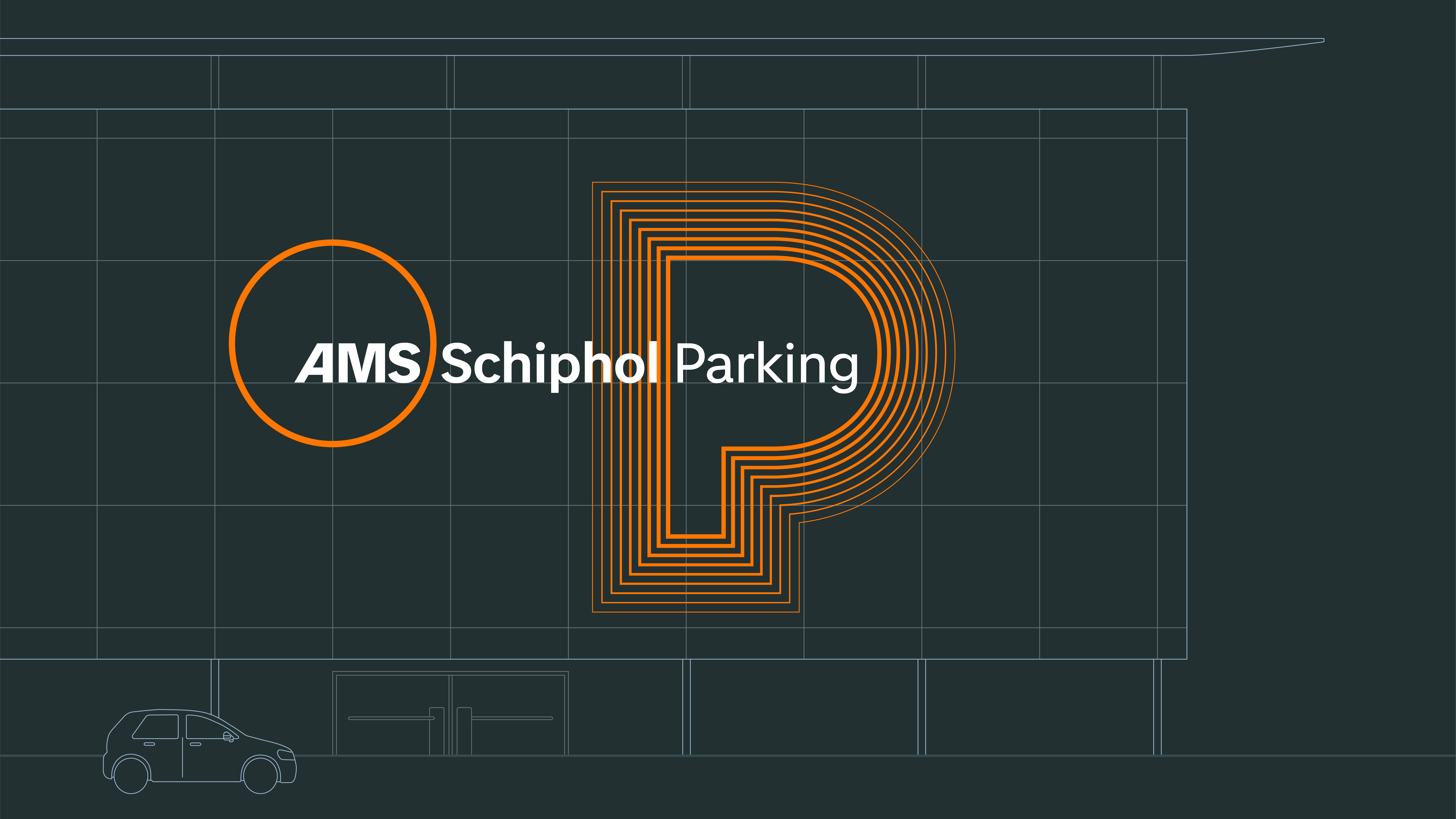
From noise to calm
Schiphol Airport
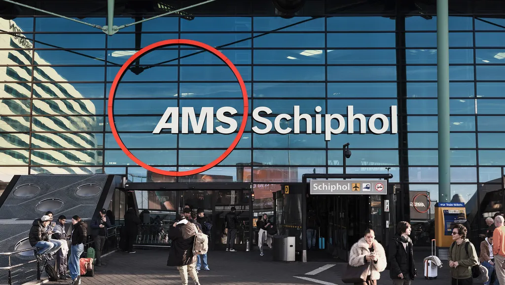
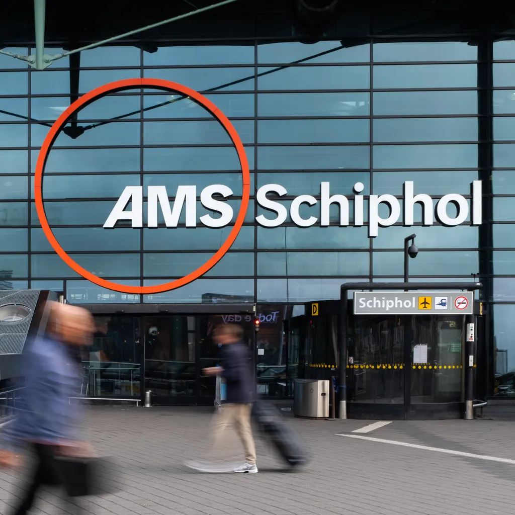
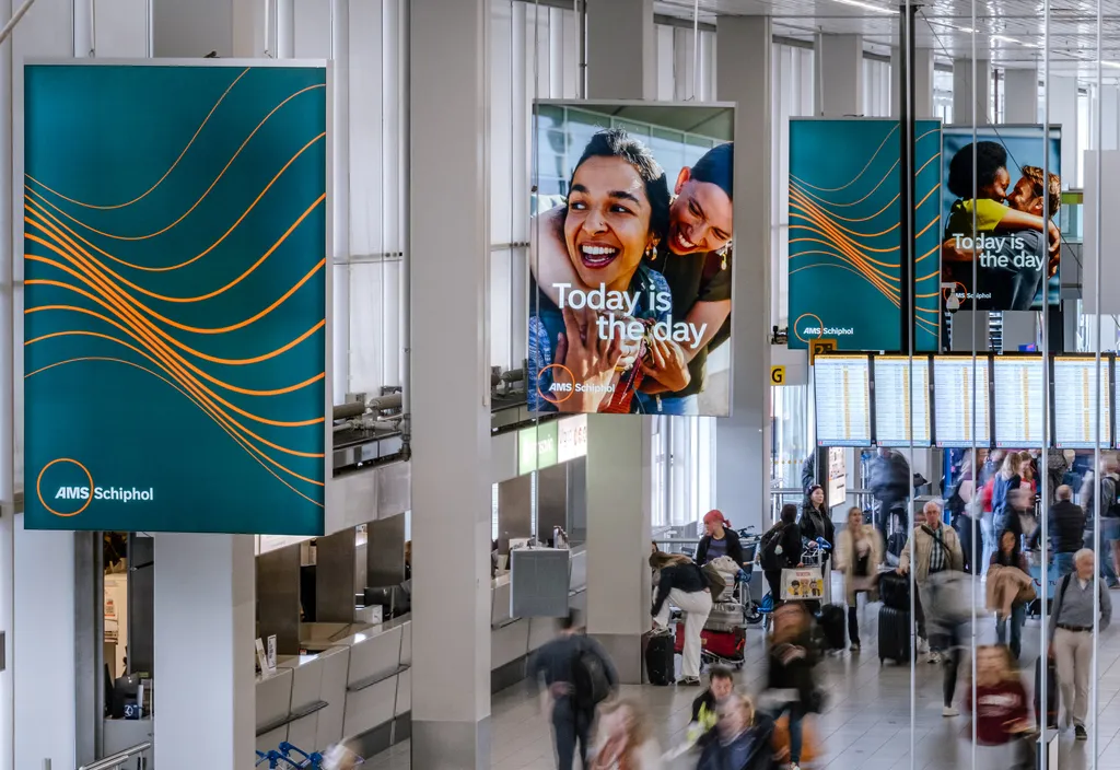
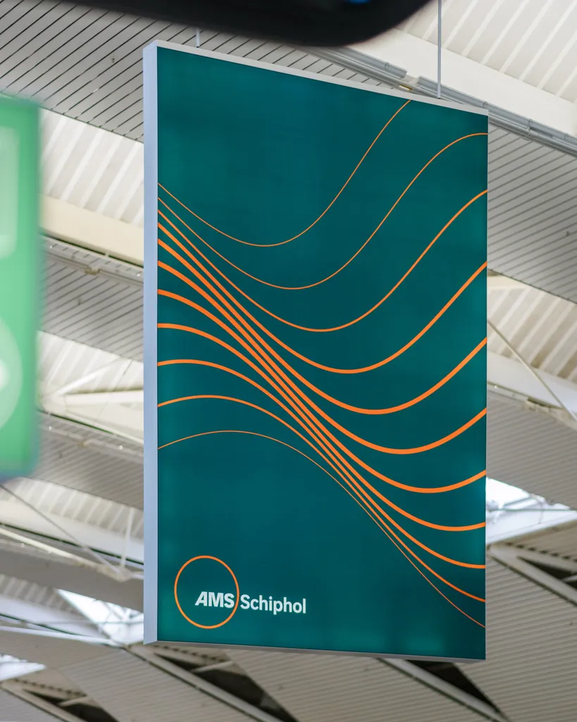
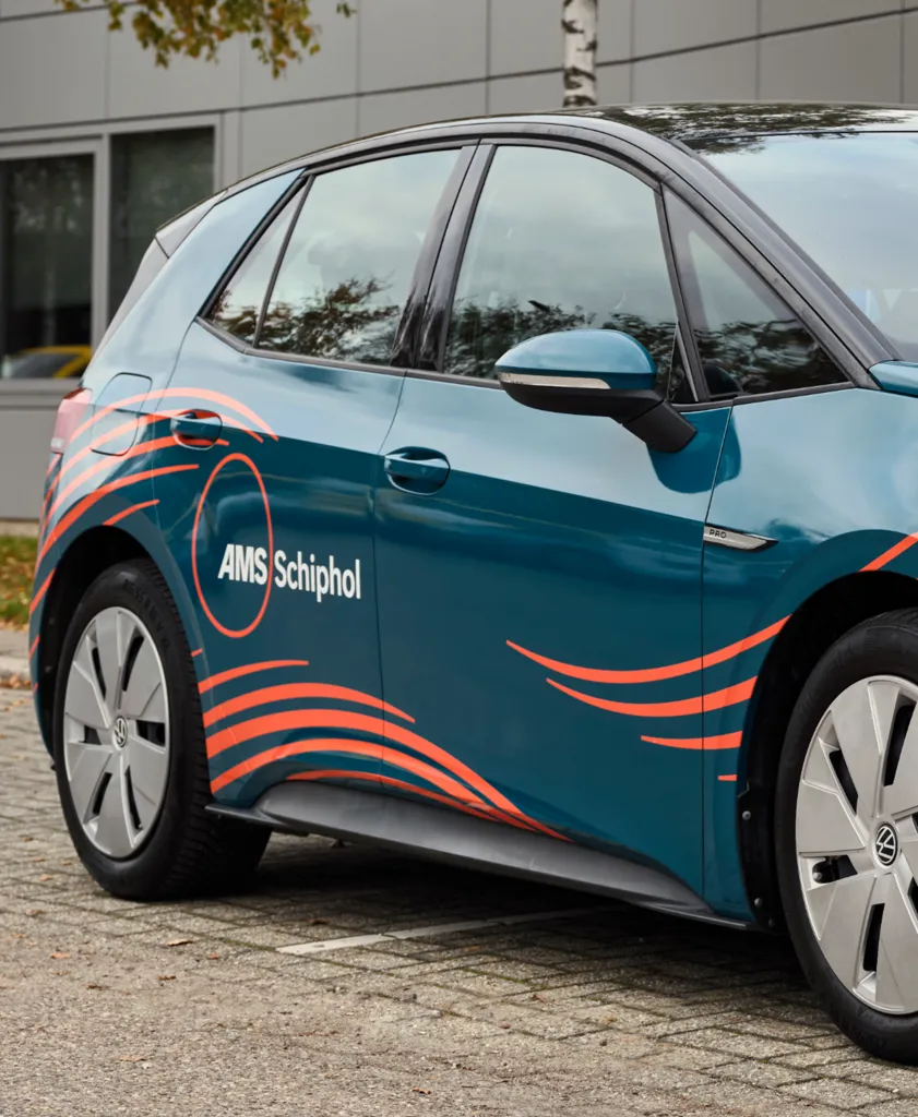
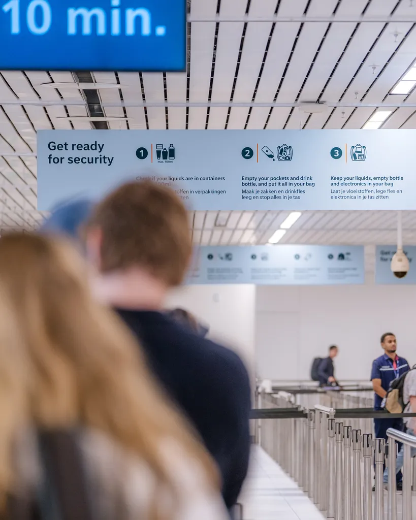
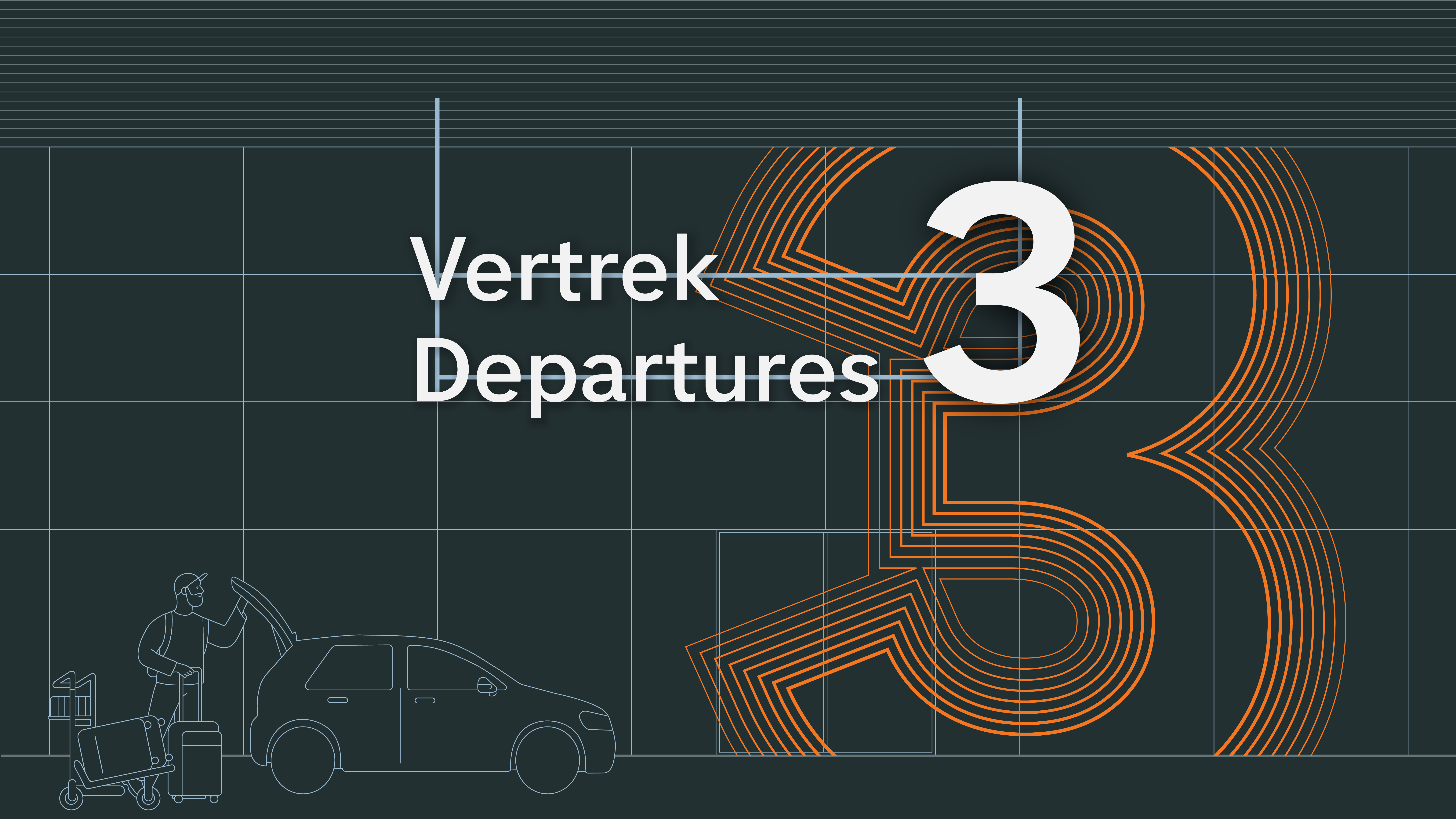
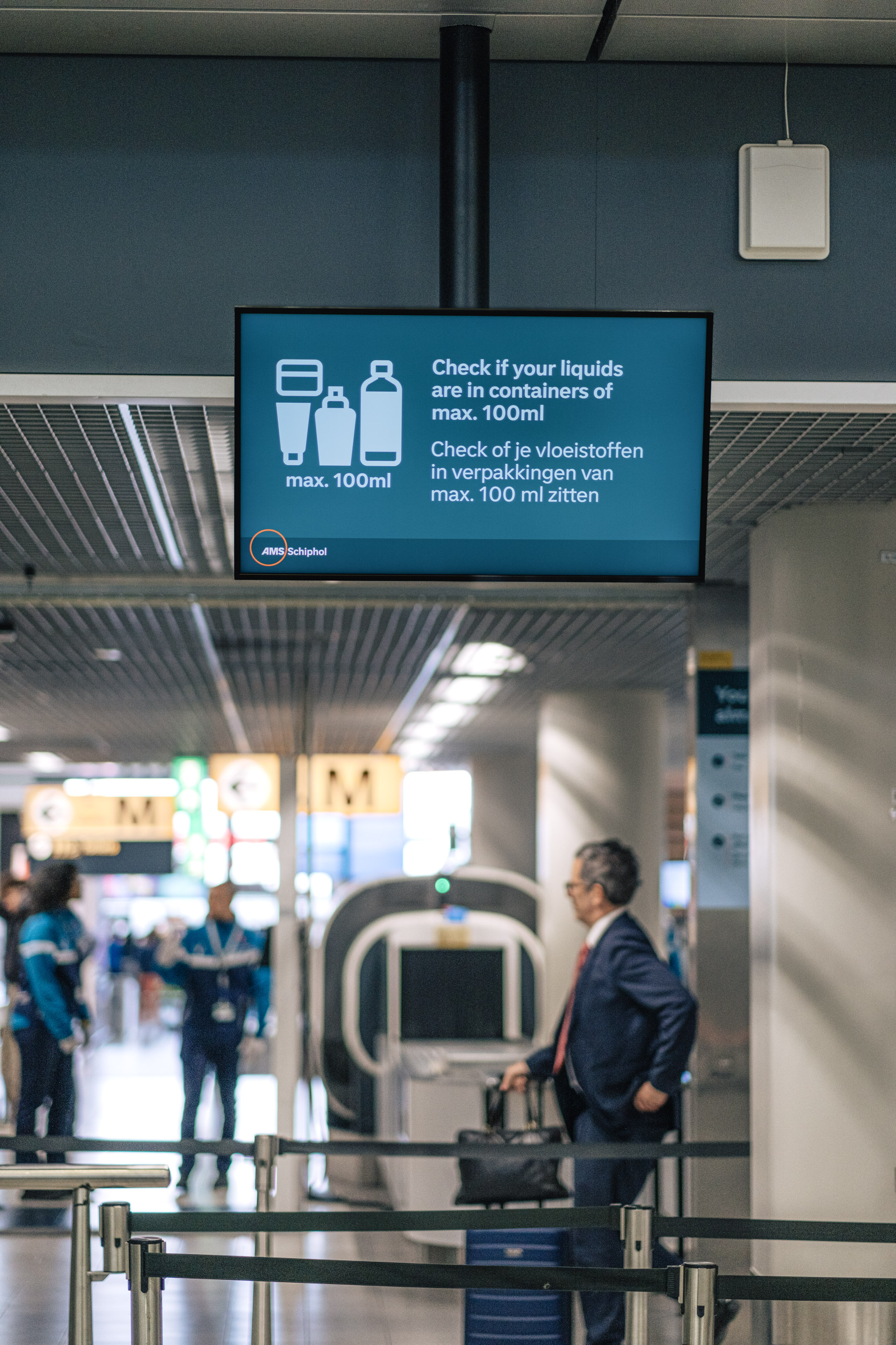
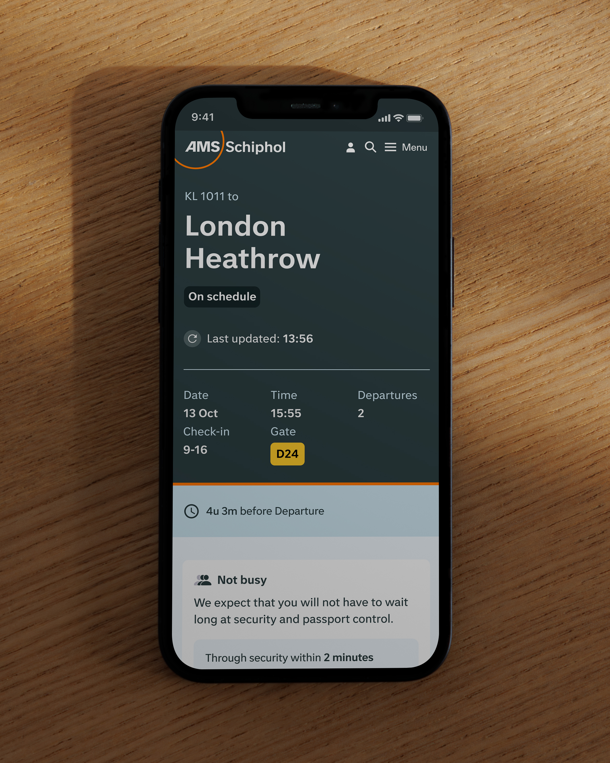
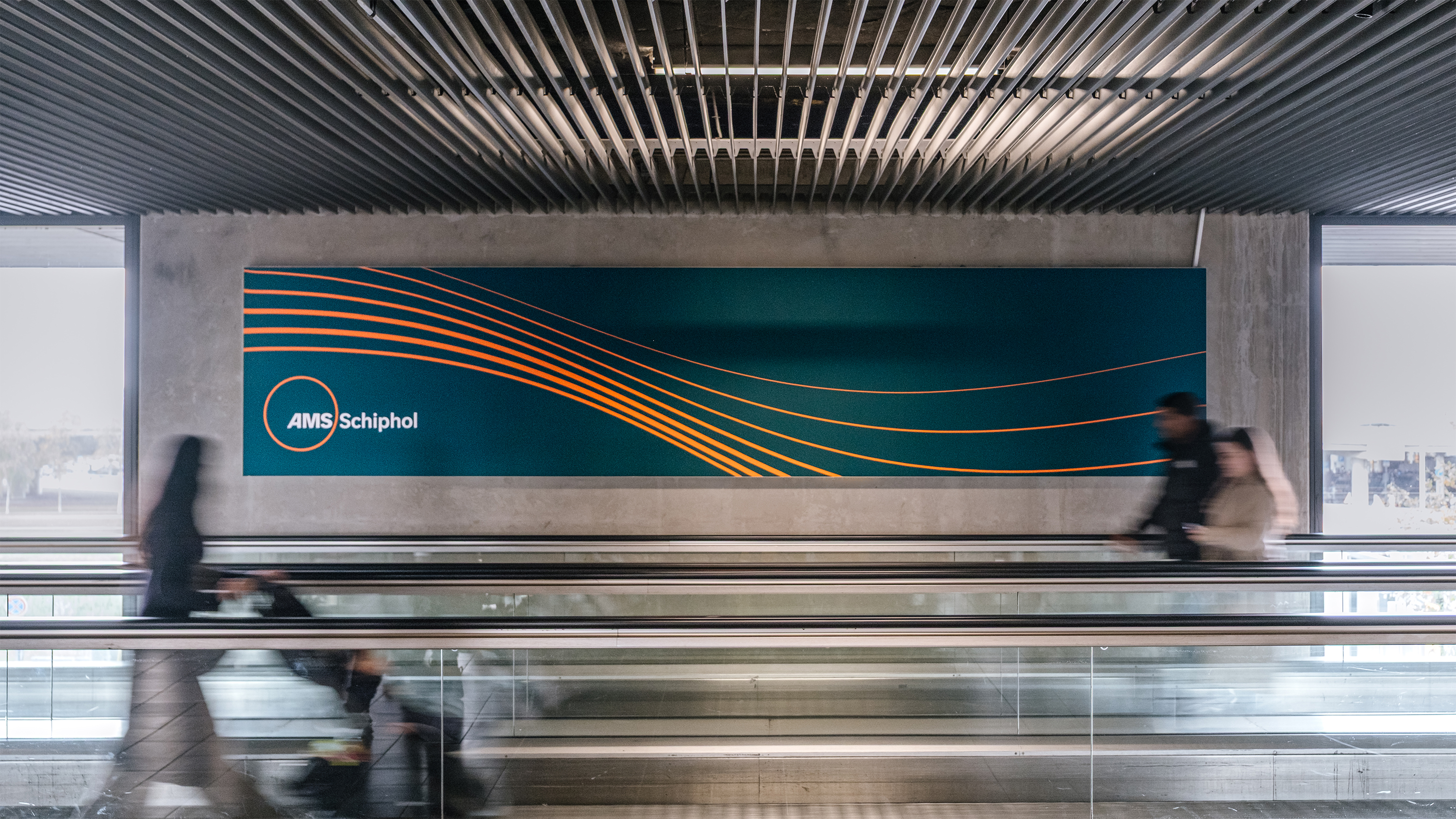
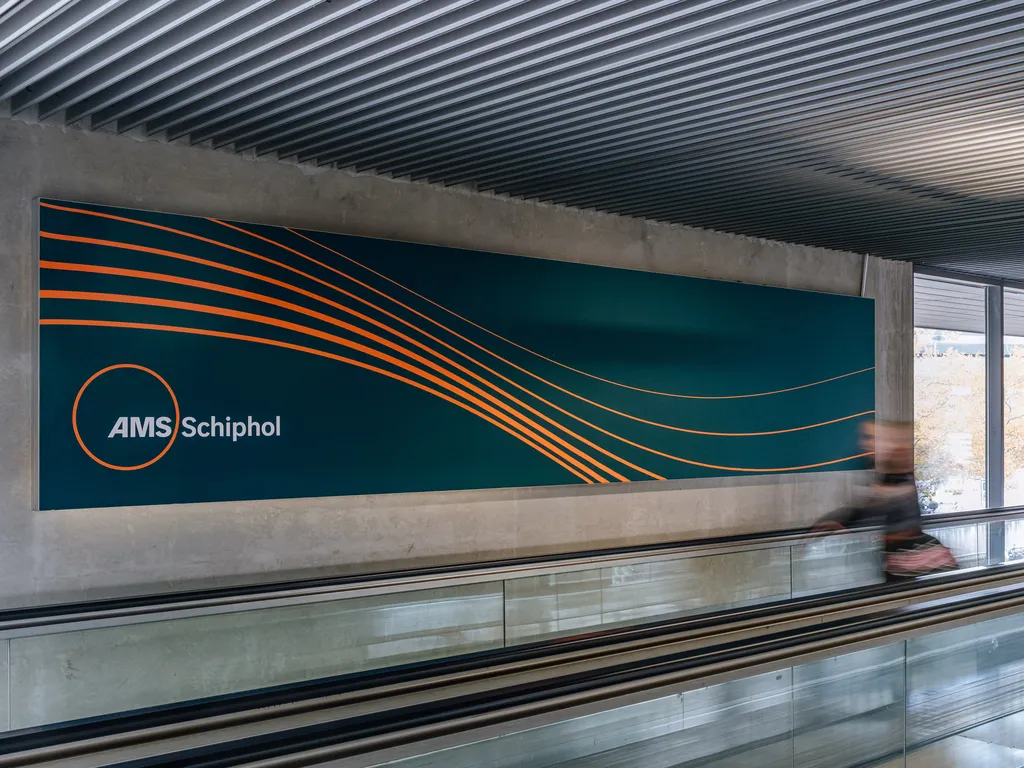
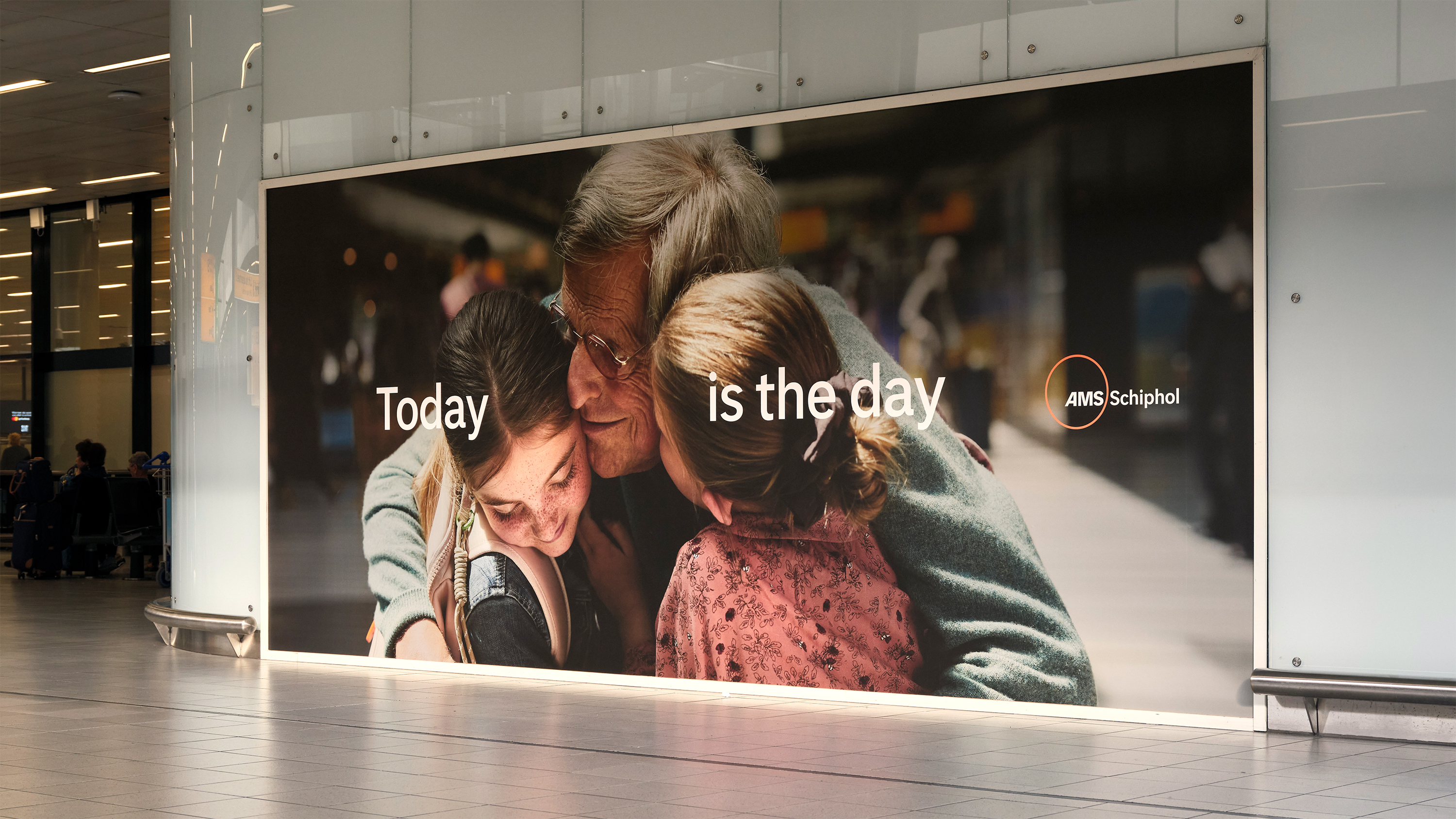
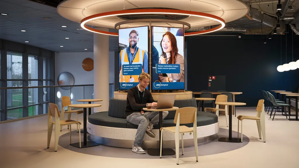
Leaving for an adventure, coming home, welcoming loved ones. There are only a few places where as many emotions and people cross paths as in an airport. Schiphol is the Netherlands’ home port for world travellers. It’s a place of national pride and international crossovers. The new visual brand identity we developed for Schiphol aims to be the calm in the storm. With a new font and a natural colour palette, we breathe rest, clarity and unity into the passenger experience.
“We wanted to bring a sense of calm into a place many people experience as hectic. The brand should help us gradually grow back into one of the top three airports in Europe.”


A truly integrated collaboration
Over a span of 5 years, Schiphol aims to get back on top. That process starts with a new graphic identity, designed in close collaboration with Schiphol itself. To develop a new image for the airport, we started with all the people and parties who help determine how the airport looks and feels today. By sitting down with all the brands, sub-brands, players and stakeholders at and around the airport, we were able to start an iterative and interactive design process that focused on the passenger experience.


Further Info
Collaborations
Eastwood Brand Consultancy – Brand strategy
ACE – brand communication
Bold Monday – Typeface
Buck – Illustrations
in collaboration with Schiphol project team
Photography
Rolinda Windhorst – Campaign
Schiphol team – Case
Thijs de Lange – Case
Featured by
Catalyst
Design Week
Beyond Branding
Adformatie (Dutch)
Het Parool (Dutch)
Het Parool (Dutch)