Illuminating Europe’s largest arthouse
LUX Nijmegen
LUX, a hub for performing arts, cinema, and debates, needed an identity that could flexibly resonate with its broad array of programs. Drawing inspiration from the concept of light—'LUX' in Latin—our design narrative aimed to highlight the richness and diversity of LUX's cultural offerings. The introduction of a gradient to the logo represents this idea of illumination, suggesting movement, depth, and the capacity for transformation.
Website
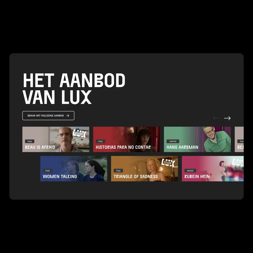
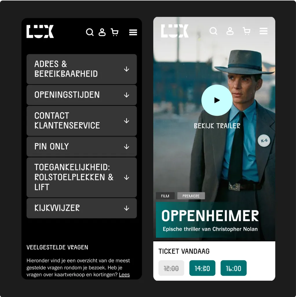
For LUX Arthouse Nijmegen’s website, we used a unique color for each program, drawing from the visual identity’s gradients. This makes the site easy to use and visually appealing. We focused on making the site interactive and filled with high-quality images from LUX, creating a welcoming and engaging experience. Our work on the website combines ease of use with aesthetics, making it a standout digital space for cultural exploration.
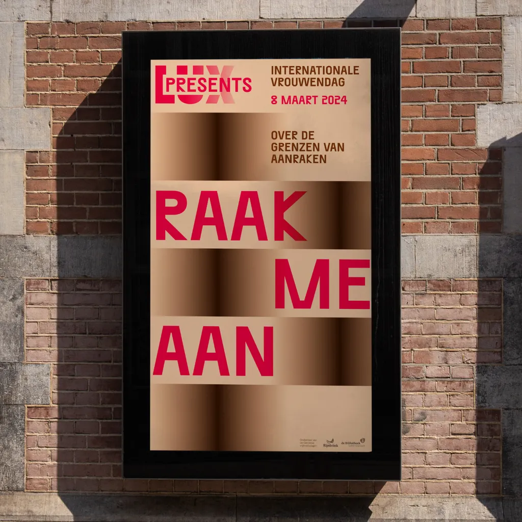
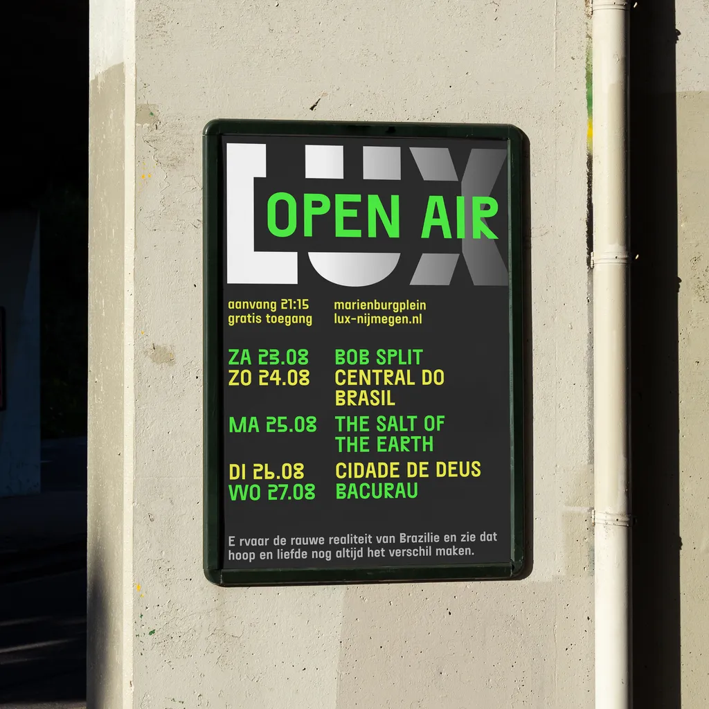
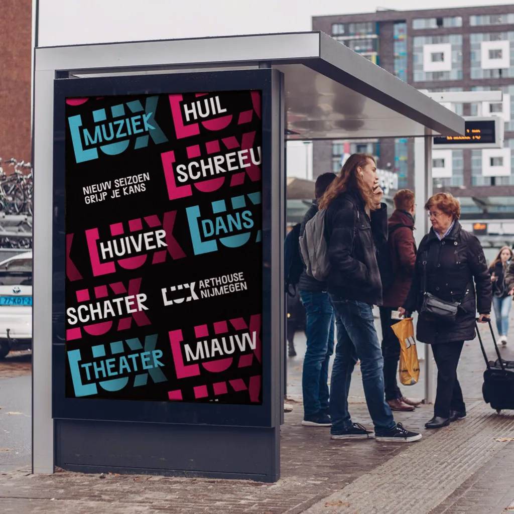
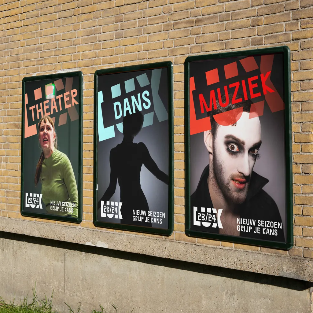
Campaigns
For LUX's campaigns, we worked closely with their team to create impactful, visually striking campaigns that blend LUX's high-quality imagery with bold graphics. We designed comprehensive 360-degree campaigns, crafting both print and digital assets tailored for various channels. Consistent, engaging messages across all platforms showcase the vibrant essence of LUX in every piece.
Further Info
Collaborations
Website UX & Development – Instance Studio
Logo design – Silo