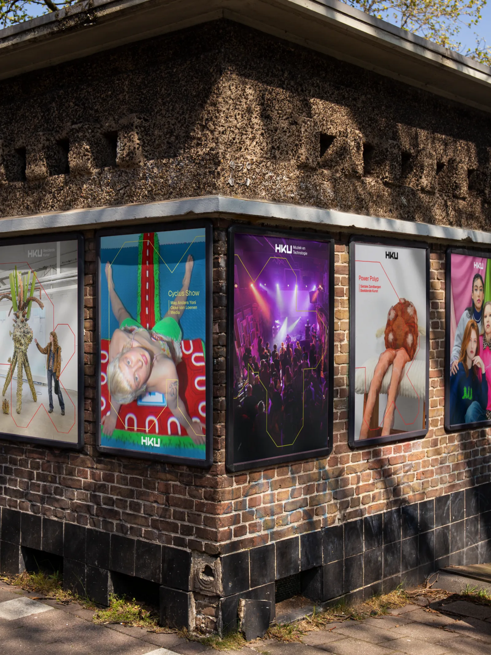
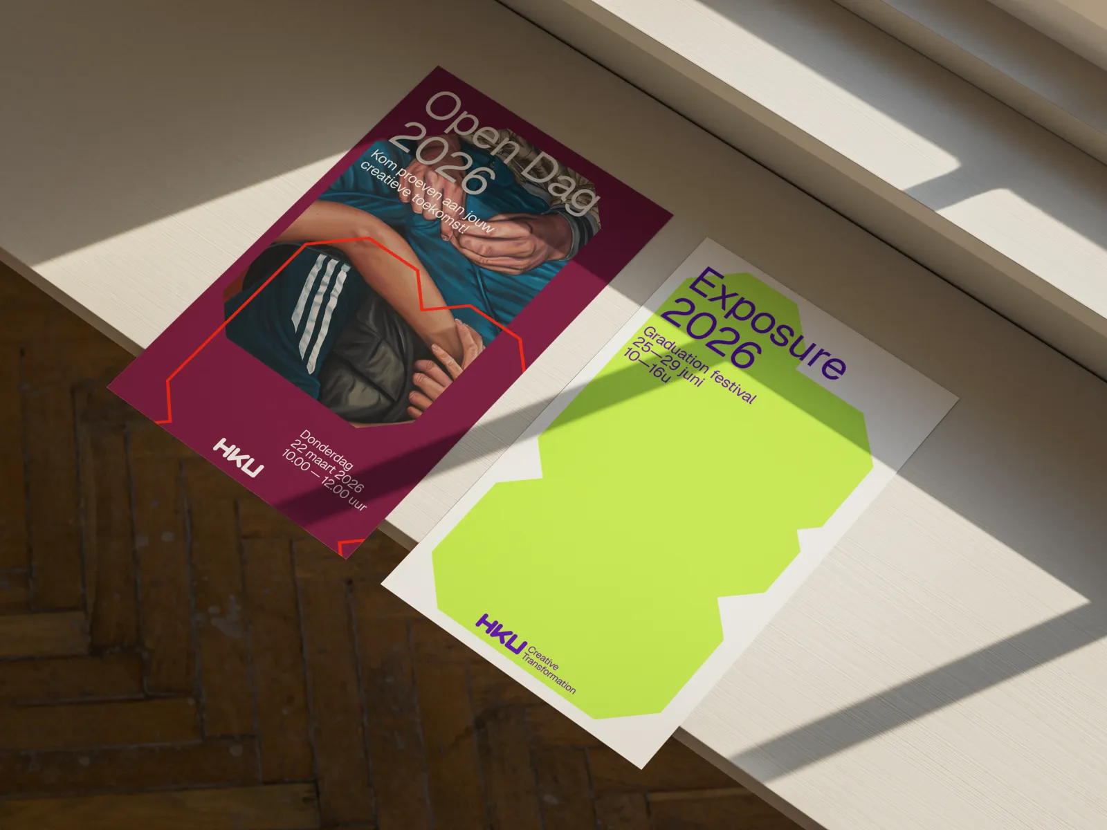
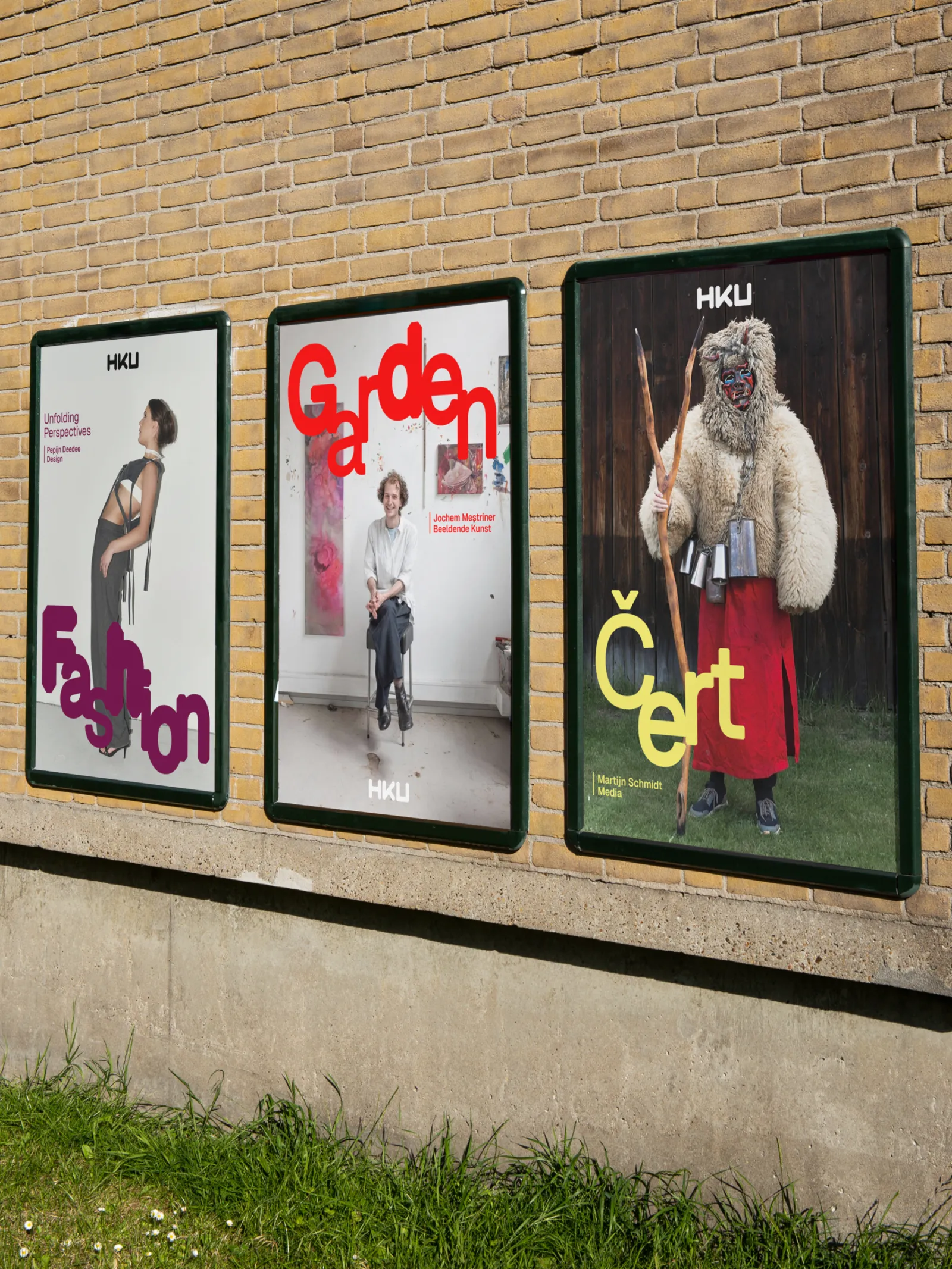
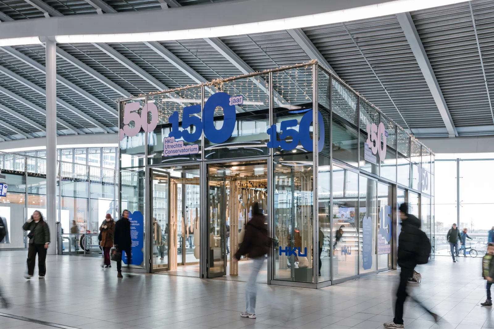
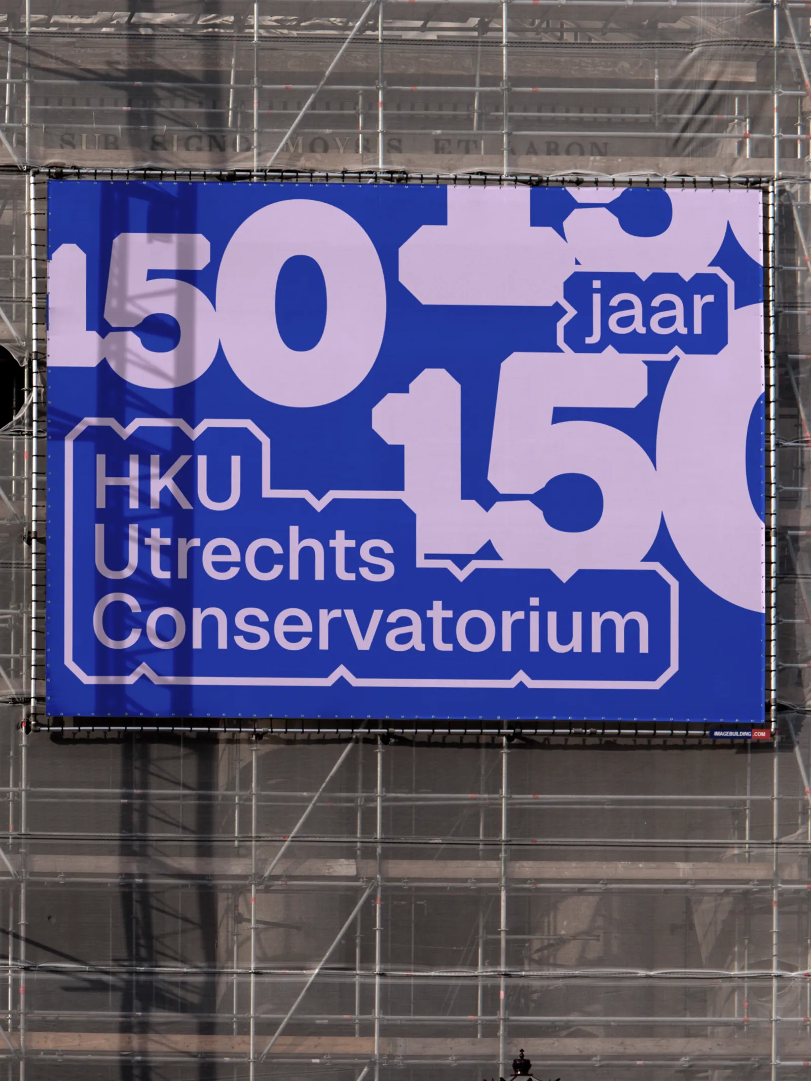
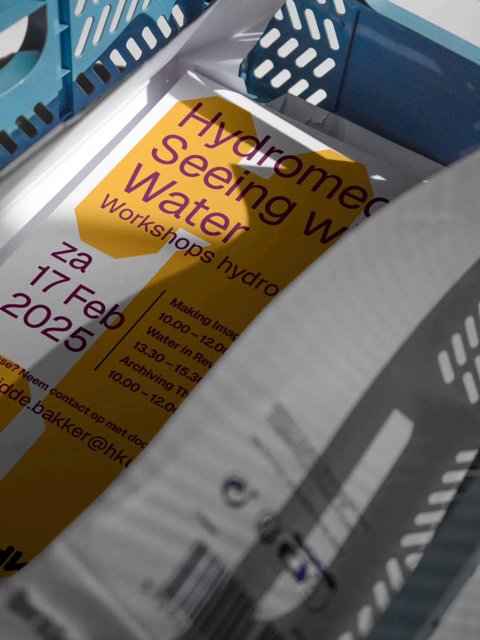
HKU is one of the Netherlands largest art academies. With 11 different academies carrying its name, it also is one of the most diverse schools in the country and one with the most students graduating in all kinds of disciplines, from Gaming to Visual arts, and from the Conservatory to Graphic Design. Being such a large organization with so many different things to communicate, over time corporate communications had overtaken the arts. We developed a new identity and logo which is based on the strong elements of the identity that was already there and leaves room for the work of its students.
Opening up an art school to the arts
HKU
Services
Field
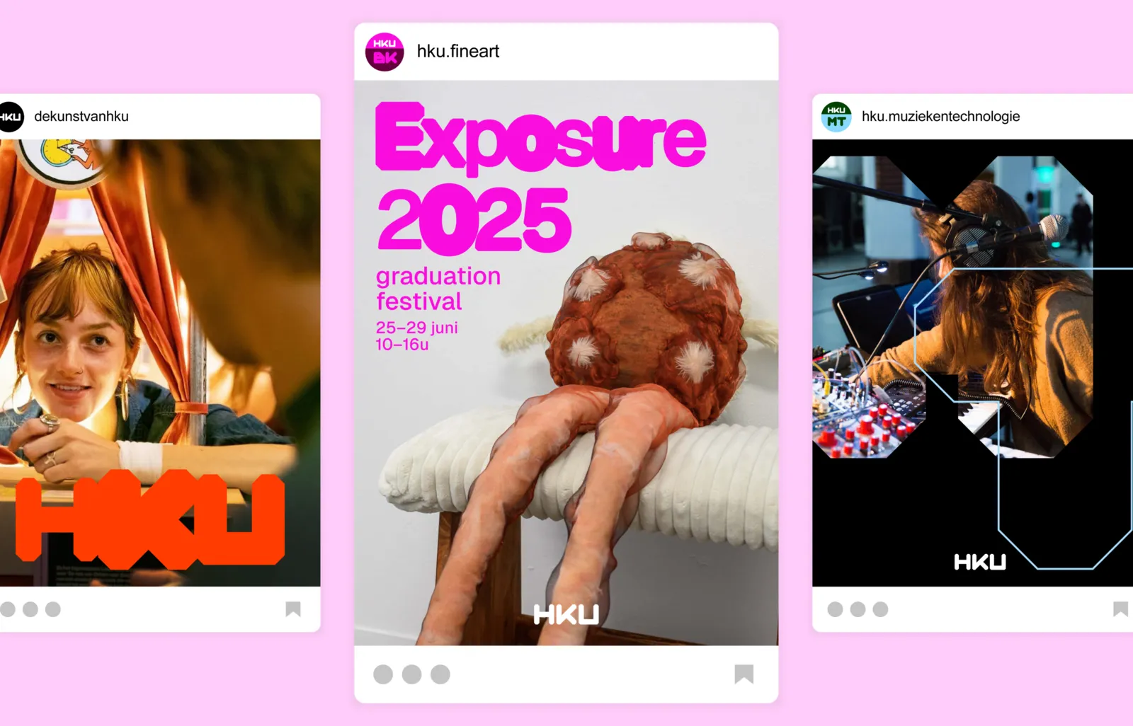
Uniting all academy logos
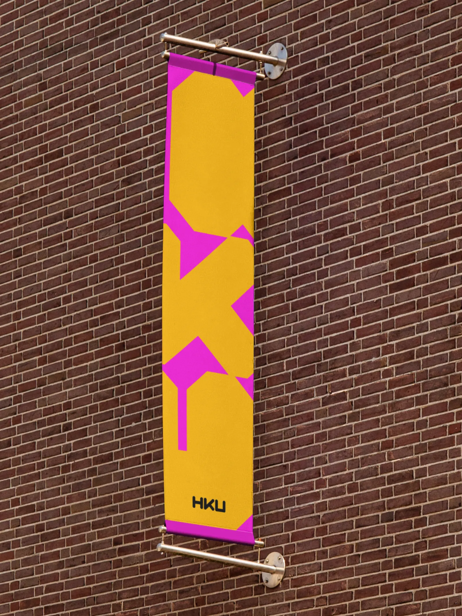
The identities of all academies feature the abbreviations of the academy names in the old HKU alphabet font, combined with the HKU logo. Each academy has its own colour combination, while the overarching HKU-brand can come in all kinds of colour combinations.

Photography
Elise van den Arend