Past, present and future of Dutch design
Dutch Design Week
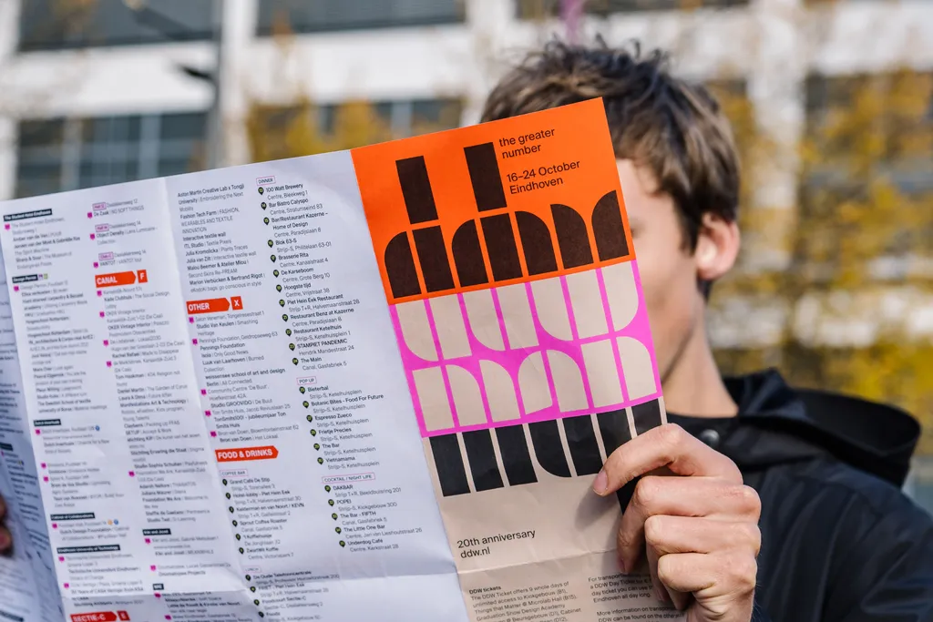

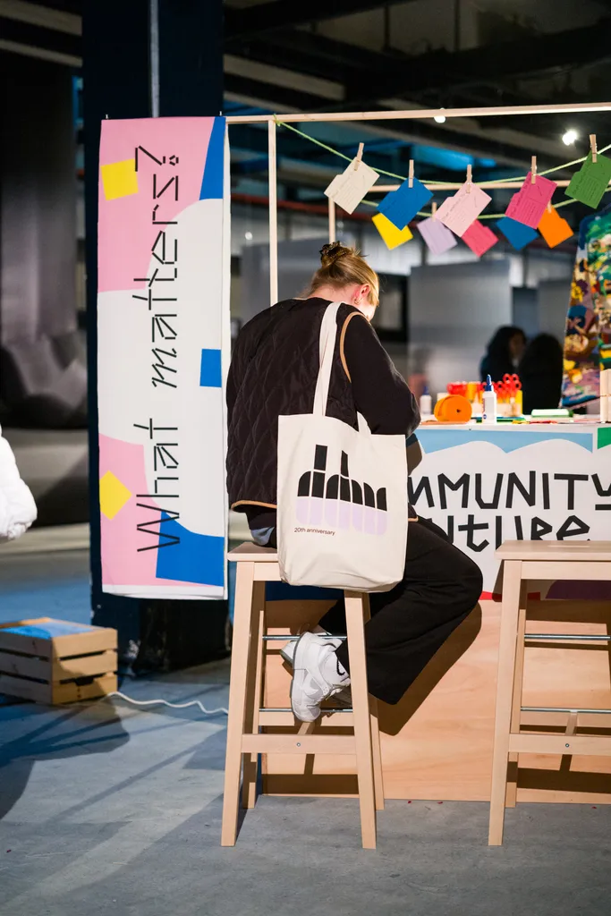
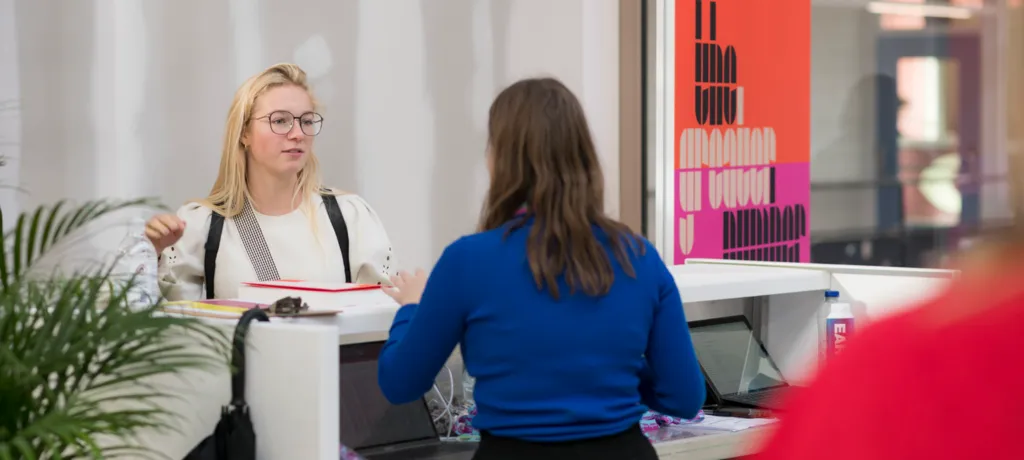
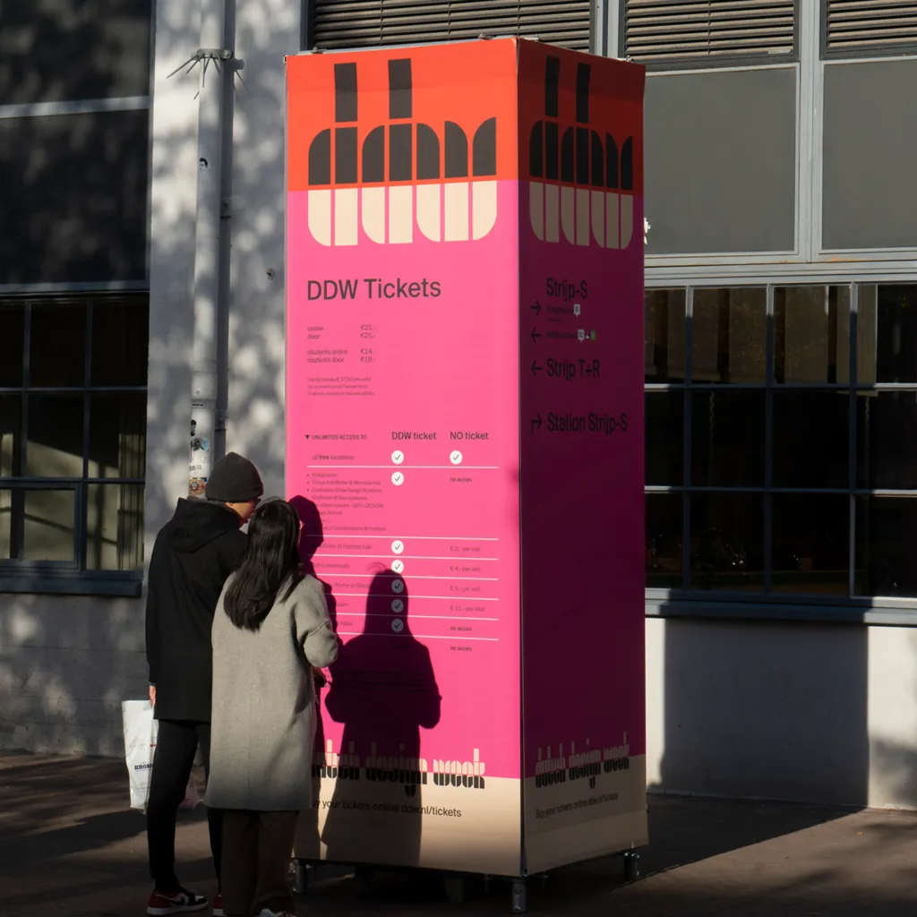
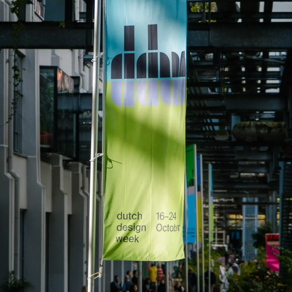
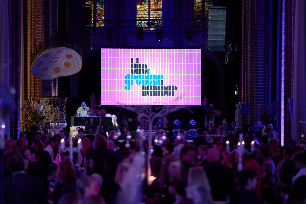
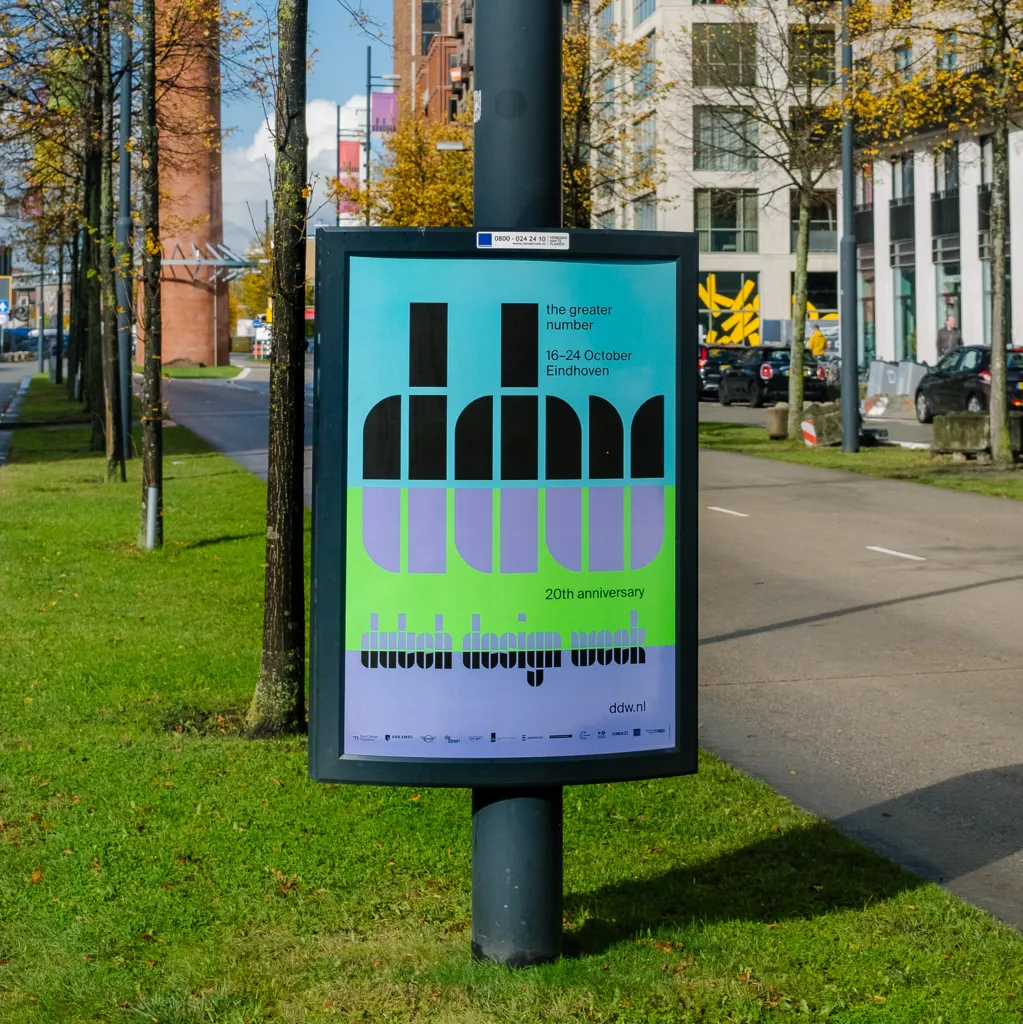
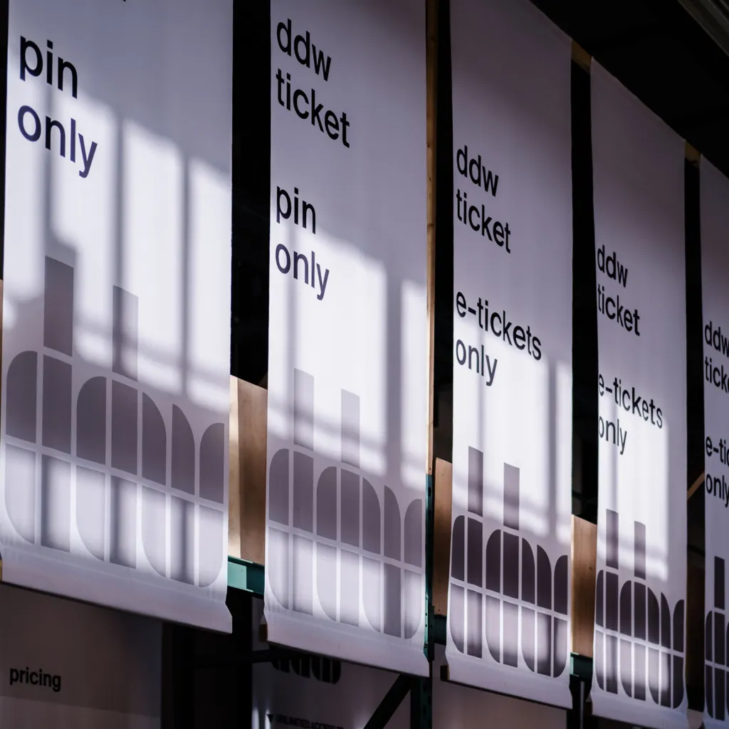
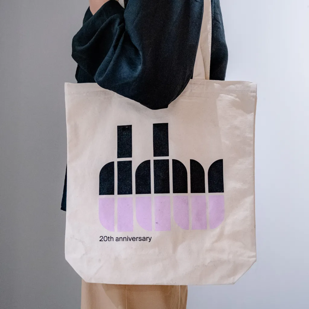
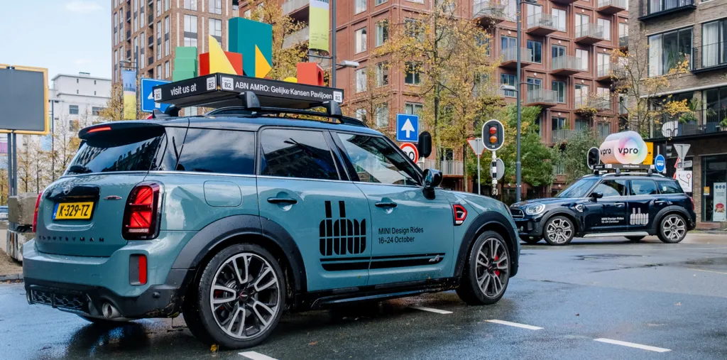
Dutch Design Week (DDW) is a significant yearly event in the design world. Beyond a logo update that modernised DDW's iconic tulip symbol, we aimed to pay tribute to one of their revered heroes, the legendary Dutch graphic designer Wim Crouwel.
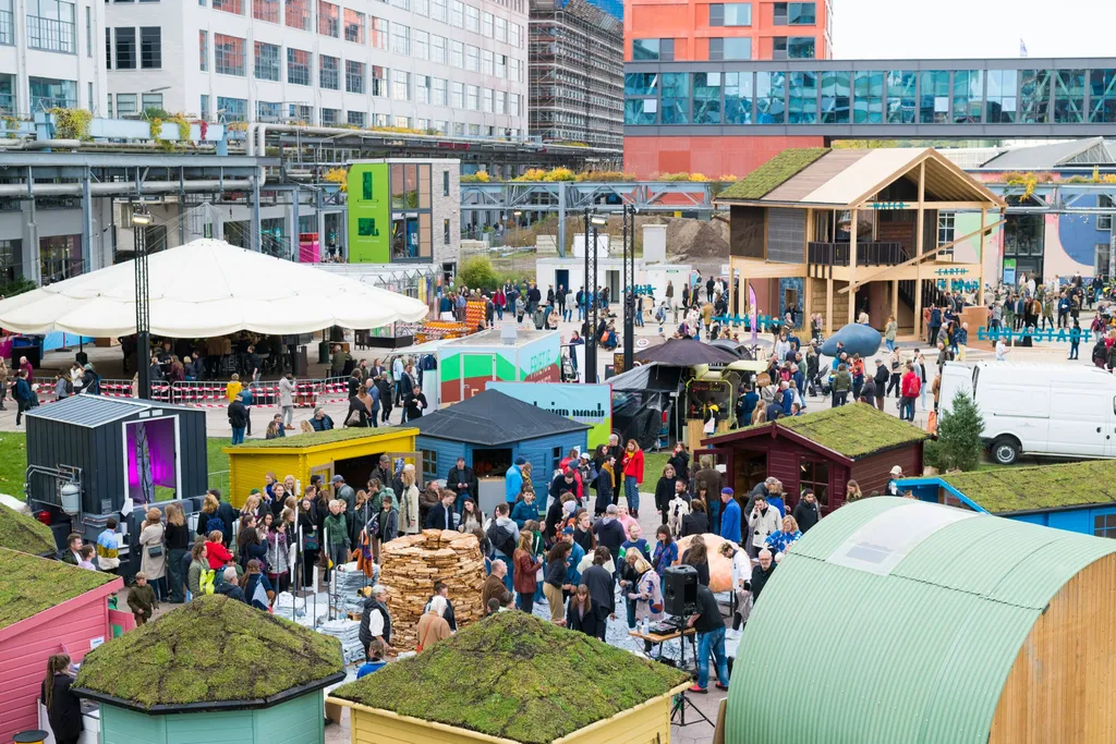

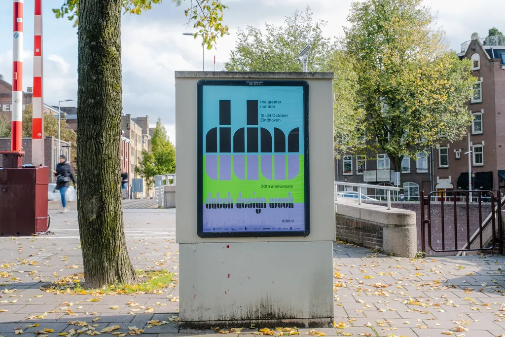
Aesthetics of the past,
language of the future
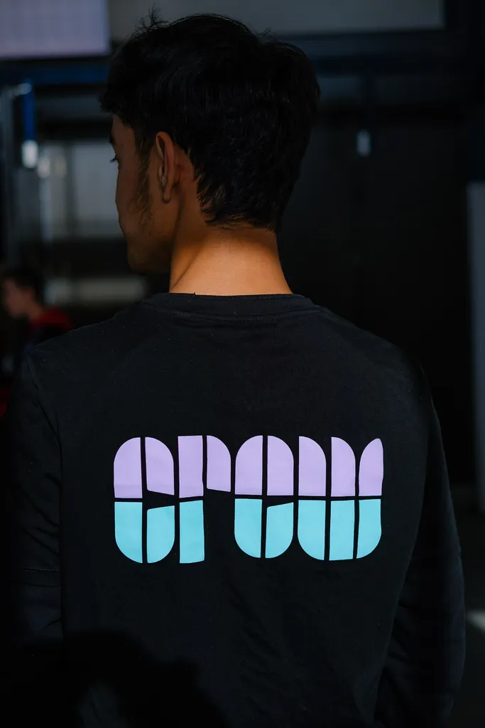
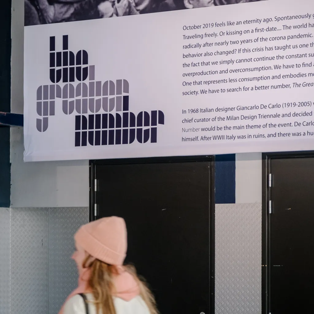
Drawing inspiration from the almost 20-year-old logo – the DDW tulip – we sought to infuse the new Dutch Design Week brand identity with a sense of history and authenticity. Exploring typographic experiments from the 1920s and the influential work of graphic designer Wim Crouwel, we found the perfect catalyst in his 1963 poster for painter Edgar Fernhout.
Guided by Crouwel's poster, we expanded the 13 letters showcased and collaborated with The Foundry Types to meticulously craft an entire font. This process breathed new life into the DDW tulip while also honouring the legacy of Dutch design pioneers.
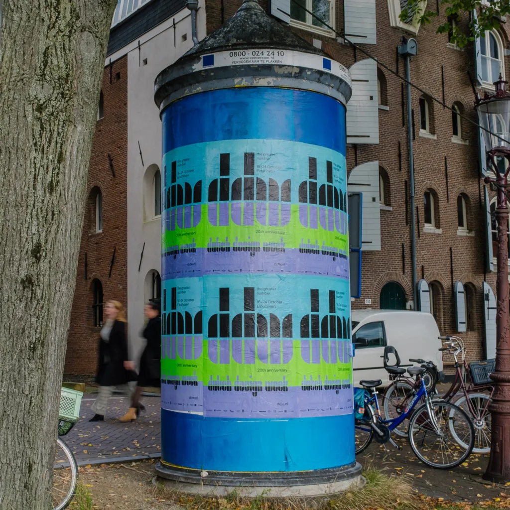
The power of designers
Designers excel in asking thought-provoking questions, establishing new processes, exploring scenarios, visualising possibilities, and giving concrete form to abstract ideas. As designers, we aim to make the world a better place, one design at a time.

Further Info
collaboration
Typeface – with The Foundry Types
Website – with Verve
Sound design – with Frank Sens
read also on
photography
Thijs de Lange
Max Kneefel
related stories
awards
TDC New York 2022 – Winner
Dezeen awards 2022 – Short listed