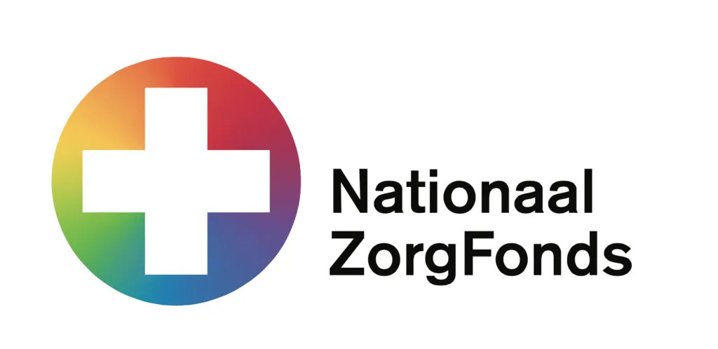
Amsterdam design studio thonik has just released a new logo for Nationaal Zorgfonds, a campaign to introduce a national public healthcare service in The Netherlands. The new logo is a plain white cross, surrounded by a circular spectrum of colours. The cross is a clear and understandable symbol for healthcare and the colour-spectrum creates an atmosphere of all inclusive: all care, for all people, nationwide.
when logos look alike
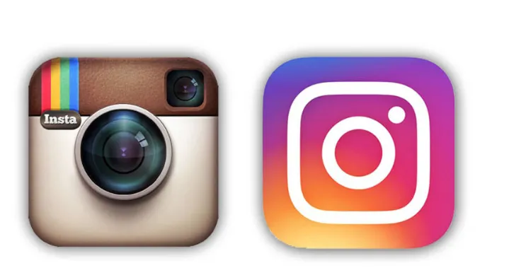
This logo project started and was even designed before last week’s release of the new Instagram logo. Yet the similarities are striking: a simple graphic drawing in white on a background of atmospheric colors. Colour gradients are quite new in western logos – although they are a regular feature in Asian design.
Maybe the approach ‘was in the air’. “A designer is always tapping into what is happening,” says Thomas Widdershoven, co-founder of Thonik. With logos anything too retro or too futuristic requires extra visual information to properly connect to people. Without a connection the impact is diluted.
A designer is always tapping into what is happening.
The Nationaal Zorgfonds is a campaign to create something similar to the UK’s NHS. The organization aims to replace the many privatized insurance companies that currently exist. To the Dutch the campaign is a stand against the neo-liberal privatization movement that has been building over the past two decades.
For the Nationaal Zorgfonds, thonik wanted a logo that would be both national and all-inclusive, though avoiding national colours. That ruled out red, white, blue (the Dutch flag) and orange (the national colour). “Those colours refer to nationalism too much and they are easily associated with extreme, right-wing populist and xenophobic politics,” Widdershoven continues. The next hurdle was to strike a balance between trend and impact. The logo needed to be able to work as the campaign will evolve. No logo should start as a finished product. It needs to grow into itself and be designed in such a way that it can evolve with the organisation.
Thomas Widdershoven is co-founder and director of thonik and Creative Director of Design Academy Eindhoven