The Vfonds is the national Dutch fund for Peace, freedom and veterans. Annually, the fund supports over 200 projects that increase knowledge about war and conflicts, in order to help people realise and appreciate the joy of living in a free democracy. In order to create a new identity as joyful as its goals, we transformed the Dutch flag into a celebratory V. The foundation of an optimistic identity.
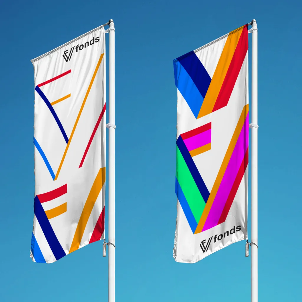
The V is for Vfonds
V, after all, does not only stand for vrijheid (freedom, in Dutch). In the Dutch language, it also stands for victorie (victory), vriendschap (friendship), vooruitgang (progress), verbondenheid (unity). Even without using words, it’s the sign we make with our hands when signifying peace. That makes the Vfonds a beautiful name, and one that ought to be celebrated within the logo and the identity.
Therefore, the new logo is built from a red-white-blue-orange banner, folded into the V. The slanted lines of the V return in all visual communication. Furthermore, because the Vfonds is there for the whole Dutch kingdom, and is proud of its place within the European Union, the colours of the logo and identity correspond to the Dutch flag and banner, as well as to those of Aruba, Bonaire, Curacao and the European Union: a fitting conglomeration of united and free democracies.