From chaos to calm in the travel experience at Schiphol—that’s what Schiphol’s new identity brings about. With a subdued color palette and a clear logo, thonik and Schiphol are adding a sense of tranquility to the traveler’s experience, and that requires more than just graphic design. Lenny Eeuwes, Creative Brand Advisor at Schiphol, explains how the brand has been translated into the visual communication of the Netherlands’ largest airport.
Translating the Schiphol brand to image
Schiphol Airport

“The new brand marks a shift in thinking for Schiphol: we’ve transformed from a functional brand into an emotional one. Previously, all of the airport’s communications were functional: ‘We’re at Schiphol,’ ‘You should be able to see the control tower,’ ‘The signs are yellow,’” Lenny explains.
“Now it’s different: the new communications focus on why you’re at Schiphol. Are you going to see your loved ones again? Are you going on a long trip for the first time? Have you been saving up for it for a long time? Bringing the travelers’ stories to life shapes the experience of the traveler watching them. All the details add up to the story.”

As a Creative Brand Advisor, Lenny ensures that Schiphol’s brand identity is visible, tangible, and recognizable in everything that travelers, employees, and neighbors see and experience. She translates the brand strategy into frameworks, guidelines, and creative choices in photography, film, and styling, and with the new identity, her role has expanded significantly:
The identity developed by Thonik has thus transformed the position of visual communication as a profession and discipline within Schiphol. Lenny: “In addition to Thonik’s graphic frameworks, I’ve shaped the brand’s substantive visual language within Schiphol. Visuals are now an extension of the story told by the identity as a whole, which has made visual language more important. This brings the airport to the forefront and turns it into a destination in its own right. “Schiphol is more than a transportation hub that connects travelers to an airline; it’s a place that travelers look forward to visiting,” Lenny explains. “‘Today is the day’ begins at Schiphol. Visual communication ensures that travelers and employees alike feel and convey this sentiment, thanks to the recognizable brand identity, which in turn strengthens trust, connection, and appreciation for Schiphol.”
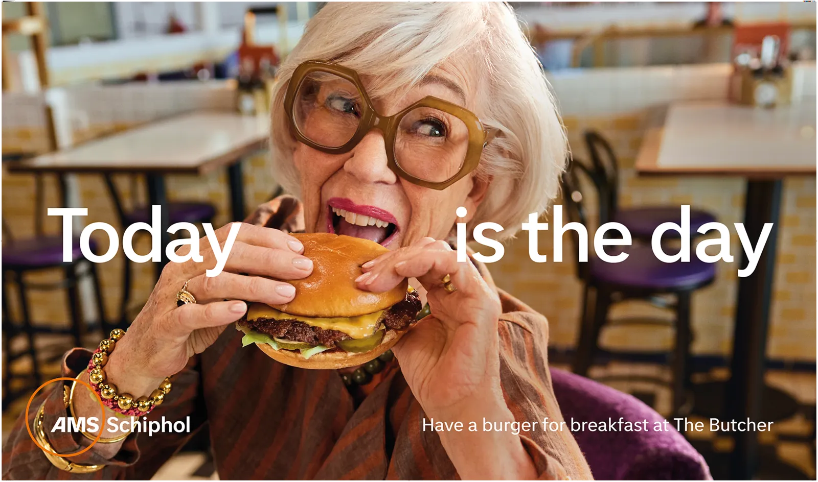
“In practice, this means that our camera work and approach have changed,” says Lenny. “We want to stay close to’ the models so that the viewer becomes part of the story. Schiphol serves as the setting for every scene and is therefore naturally present, but the airport isn’t the focal point. The atmosphere is warm, and the colors from the brand’s color palette—Golden Dune, North Sea Green, Sky Bliss—loosely form the color range we’re looking for in our photography and videography. Finally, we strive for cinematic-quality imagery in everything we do,” Lenny concludes.
“We’re looking for a certain softness, a blurriness, that lets the emotion seep through the image, so that you, as a traveler, can feel it too and experience it a little bit.”
If you ask Lenny, that emotion lies precisely in the details: “All our visual content providers—from photographers to stylists and from casting to sound design—now have a clear guideline.” This way, all communication becomes part of a whole that travelers can subconsciously relate to.
“I don’t think the average traveler is particularly concerned with exactly what there is to see, but consistency and quality do ensure that, even as a traveler, you subconsciously pick up on a vibe that contributes to your own emotions: this is your day. This is the moment you’ve been looking forward to.”

And to ensure that happens, Lenny and her colleagues weave the feeling and atmosphere of the brand identity into every layer of communication: in the “touch,” “tell,” and “sell” layers, you can see the emotional approach and color palettes reflected as well—sometimes more prominently, sometimes less so.
“Touch, tell, and sell are no longer separate communication categories, but a spectrum encompassing all layers and aspects of communication.”
“Whether it’s informative or sets the mood, everyone’s communication must contribute to the brand experience,” Lenny explains. “It can no longer feel like a joke or a gimmick; there now needs to be a story in it that travelers can relate to and that fits the brand.” That means: staying close to the core. And more overlap between ‘touch,’ ‘tell,’ and ‘sell,’ to prevent ‘sell’ from coming across as too intense or ‘tell’ from being too informative and cold.
Lenny: “When an image feels intimate and evokes recognition—and, on top of that, comes across as calm, pleasant, and clear—it really resonates. That’s when it sinks in.” And that’s exactly what the new Schiphol brand does.