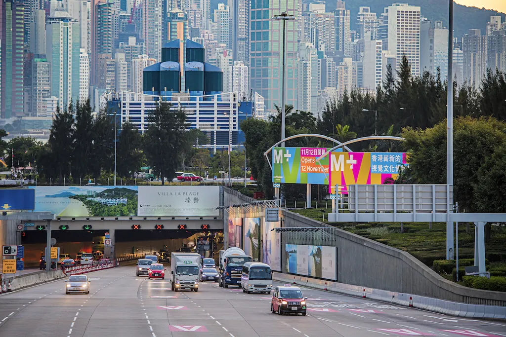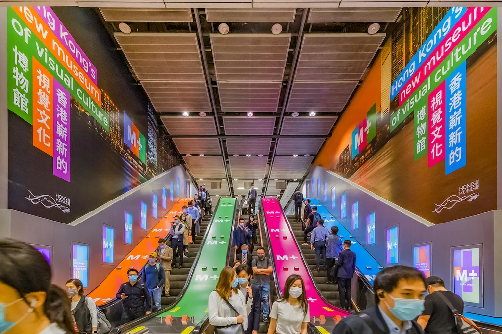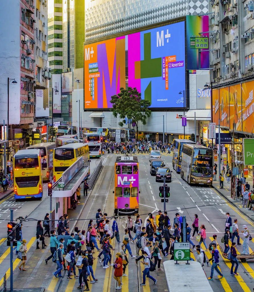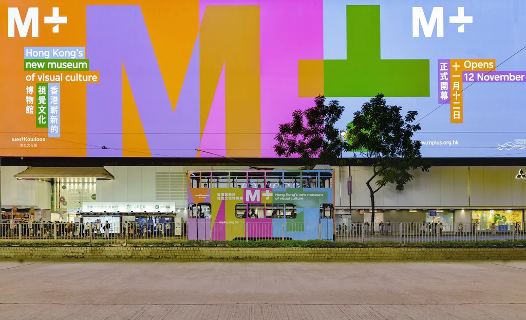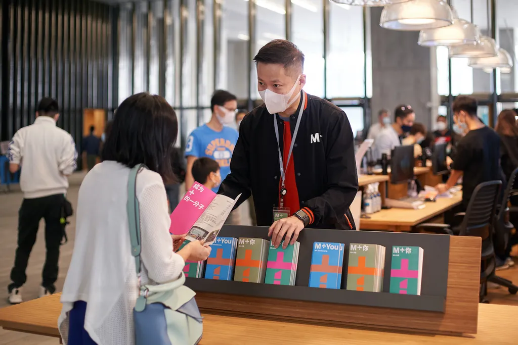
M+, Hong Kong’s new Museum on visual culture, focusing on 20th and 21st century art, design, architecture and moving image opened its doors at the end of 2021. Thonik developed a visual identity that works across the institution’s physical and digital platforms.
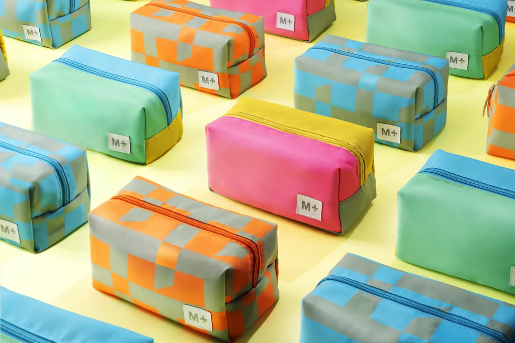
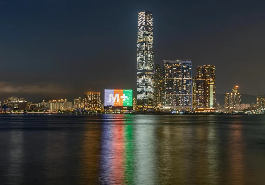
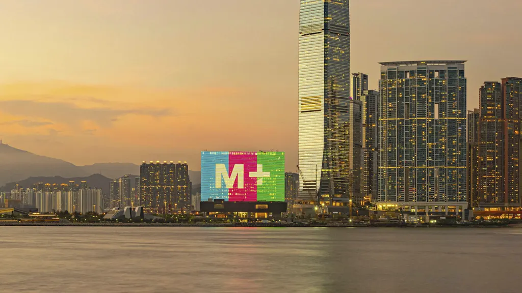
M+ visual identity uses a range of mid-tone colors. These colors are selected to be tonally equal to 50% black. Ranging from mid-gray to vibrant orange cyan and purple/pink these colors reflect Hong Kong’s urban fabric: grey high rises and colorful, neon, commercial communication. When they are used as backgrounds for text, black or white lettering will always be legible. Horizontal text for English and vertical text for Chinese echo the two directions of the ‘+’.
The new identity is vibrant in the opening campaign, effective online and well balanced on site. The museum shop features a special M+ product line.