Language can be what unites and what divides us. On a local level, our words have been a handy tool in getting around, estimating safety and accommodating strangeness in the near surroundings. In a globalised world, the many languages of humankind can make things occasionally complicated.
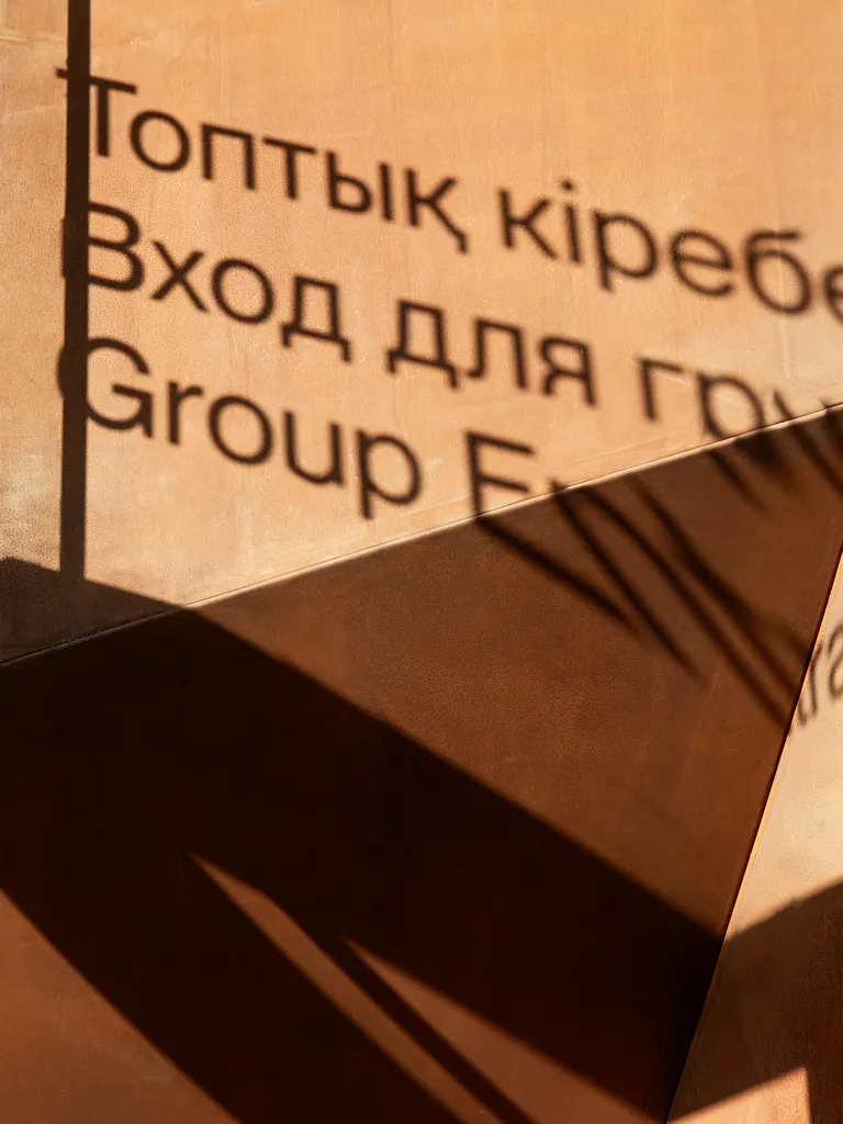
In China, bilingual design has always been a reflection of the geopolitical balances of power and tastes: in 1841 Hong Kong became a British territory and Shanghai in 1845 got a foreign enclave, that changed both local politics and streetscapes: the traditional calligraphers who made the street signs had to start taking bilingual design into consideration. In the decades that followed, the interaction between east and west increased at the turn of the 20th century and the rise of artistic movements of Art Nouveau and Bauhaus inspired bilingual typography. The languages were combined, but the reading directions remained traditional: a Chinese person would read a bilingual sign right to left, and an English speaking person would read it left to right.
In the 1950s, this started to change: as consumerism flourished and western brands entered the Asian market, the demand for bilingual trademarks arose in Hong Kong and Shanghai. Chinese was adapted to English: the reading direction of both became from left to right. As China opened up, in the 80s, English actually gained a dominant place in bilingual designs, as Deng Xiaoping aimed to make the people aware of better times ahead – times in which one could strive for the luxury that imported goods conveyed.
With the 1980s 40 years behind us, bilingual design has continued to develop. Bilingual design in China once aimed at opening the door to the west, rather than accommodating the non-Chinese speakers. Up to not too long ago English was also idealised as it was considered key to a more balanced and calm design, given that Chinese characters can appear quite dense.
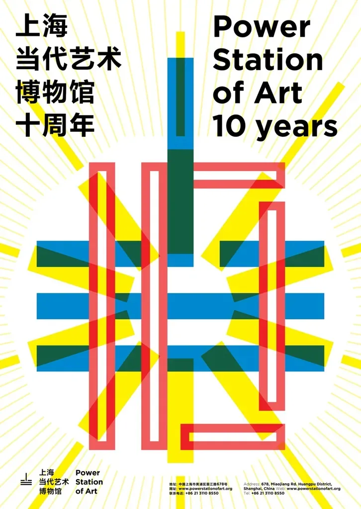
thonik believes good bilingual design is exactly that: bilingual. The two languages, in this case Chinese and English, are to be each other's equals. The layout is there to balance out the two.