New typeface for Dutch Design Week

Festival logos tend to morph over the years and sometimes lose touch with the rest of communications. This happened to the Dutch Design Week tulip. Thonik gave the almost 20-year-old logo a new lease on life by styling it as the W in the event name. “The image becomes language and logos becomes logo,” says Thomas Widdershoven. “The new concept is open and fluid without explicit branding.”

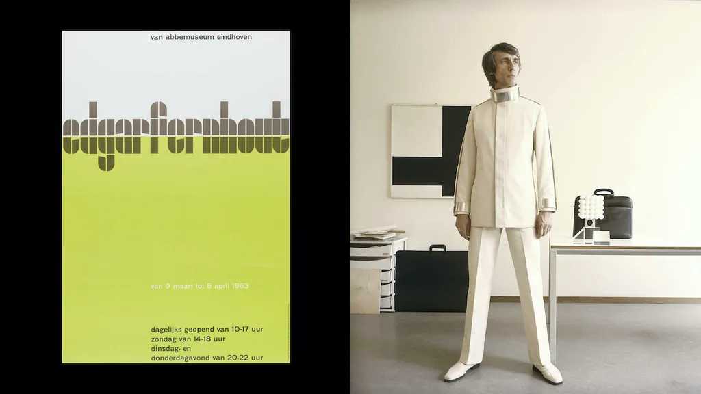
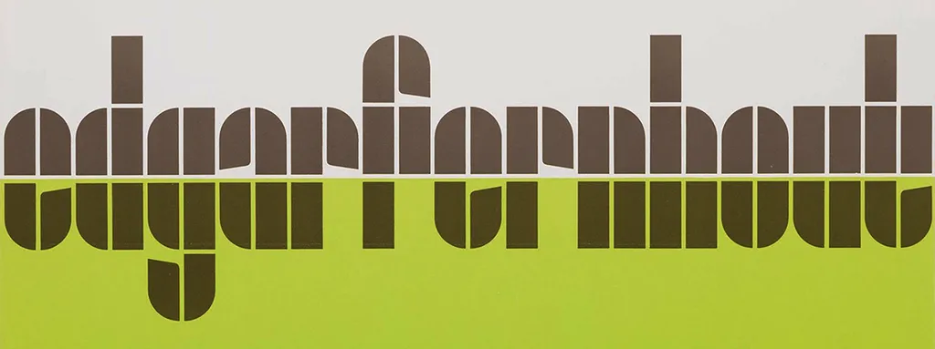
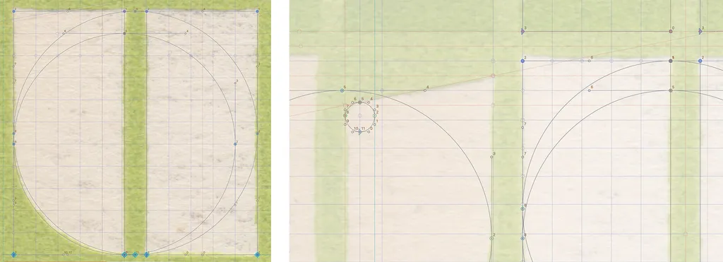
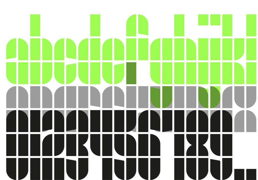
DDW’s tulip is a constellation of rectangles and quarter circles. These elements were also used in typographic experiments from the 1920s that were revised in 1963 by the late Wim Crouwel. For the Van Abbemuseum retrospective of Dutch painter Edgar Fernhout, Crouwel developed a rather sophisticated take on the typeface by subtly adding indentations to the E, A, R and T. This added rhythm to the logotype and gave it character beyond strict geometry. Having been designed for a museum in DDW’s native Eindhoven – Thonik thought Crouwel’s Fernhout typeface would make a fitting candidate for the new house style.

ddw-typeface_03.jpg
edgarfernhout.jpg

But Edgar Fernhout’s name only holds 13 letters and not all the ones that spell Dutch Design Week, let alone other messages. With the blessing of Judith Cahen, Crouwel’s partner, studio Thonik set out to design the other half of the alphabet, a full set of numbers and punctuation marks. Thonik teamed up with Stuart de Rozario and David Quay of The Foundry Types. Quay in particular worked extensively with Crouwel in the past.

screenshot-2021-03-17-at-11.42.58-copy-1.jpeg

“This project allowed us to continue Crouwel’s ethos and vision which we got acquainted with during a collaboration we hold dear,” say de Rozario and Quay. “Just like Crouwel’s lettering, his posters and catalogues are unique. All vary in a style and execution, often displaying humanity within his strict modular grid vision. Systematic, logical, but crafted by hand and with a keen eye.”

screenshot-2021-04-09-at-12.14.25.png

In the original Fernhout poster the letters are cut in half by two areas of colour. Thonik placed the DDW acronym, with the W a dead ringer for the old logo, against a similar horizon. The colour scheme also takes its cue from Crouwel. “He was a great colourist,” says Widdershoven, “and he often used subdued tints to highlight the brightness of others. In the past we used to employ clashing colours, but over the years, especially after curating Broken White at the Van Abbemuseum, we’ve become more sensitive to these subtleties.”Expanding the Fernhout font posed some challenges, recounts Widdershoven. “Crouwel loved monospaced letters so the fact that Edgar Fernhout’s name doesn’t contain a W, M, L or I must have appealed to him. We did have to tackle those letters and have tried to finish the game while playing by the same rules. We’ve chosen all lowercase letters since they feel more democratic and look sympathetic. The use of indentations has helped increase legibility, but it’s a work in progress. For example, we’re still busy putting together a good 3.”
It’s a rather big step from two words that were used only once to a fully-fledged typeface, Widdershoven admits. “Crouwel never meant it to be a font so we allowed ourselves some leeway.” The resulting typeface will be commercially available. Its use is open to all, except festivals in the Netherlands and design events worldwide. Animating the newly developed font for the DDW site felt natural, according to Roy Terhorst, partner at Thonik. “When the letters started moving, the underlying grid became visually present. A bridge was forged between the aesthetics of the past and the design language of the future: motion design.”

Further Info

related website
Eye on Design

See also