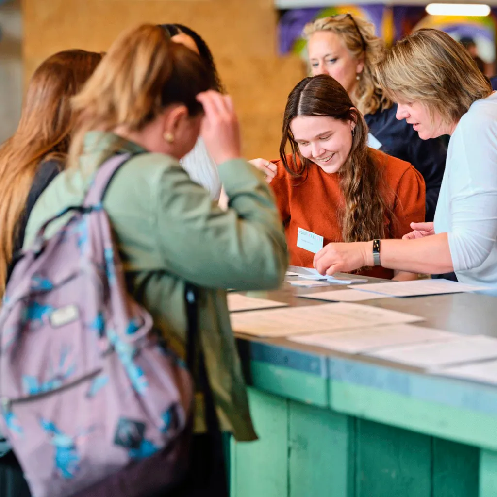
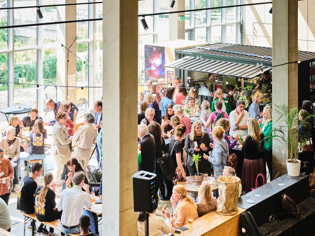
The nonprofit ‘Kwaliteit Blijvend Leren’ (KBL) is a network organisation that connects various parties in the field of youth support. An important task in a country where care and support for the youngest citizens is increasingly under pressure of fragmentation, shortages and budget cuts. At KBL, youth representatives, client organisations, professionals, policymakers, and researchers join hands in creating a national environment for continuous learning and improvement of young people’s lives — be it in the form of (mental) healthcare, sports or foster care.
What will Dutch youth care look like in 2025?
Uniting a whole sector in an identity
When KBL came to us to rework their positioning and develop a new identity and website, we aimed to create a visual translation of their ability to unite so many diverse voices in a complex and dynamic landscape.
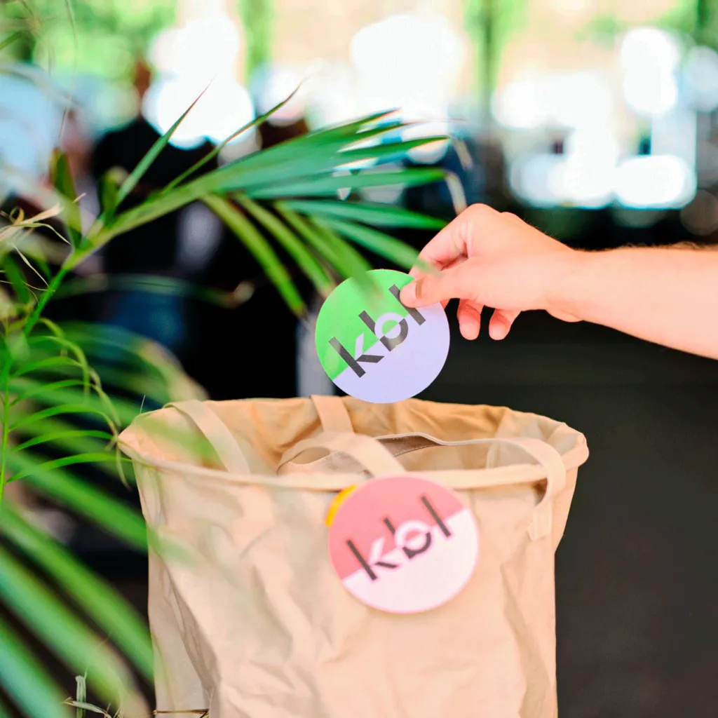
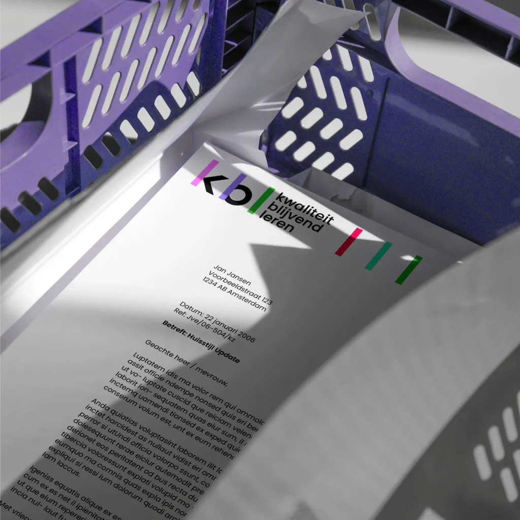
The new visual identity is grounded in simplicity. Using basic geometric shapes as a foundation, it mirrors KBL’s approach to bringing diverse partners together around shared goals. The colour palette pairs vibrant tones, breathing optimism and energy, with structured design elements that communicate clarity and trust. Together, these elements embody KBL’s forward-thinking, collaborative ethos.
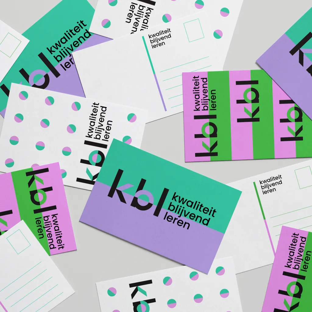
Stripes to structure
To reflect KBL’s network in the visual identity itself, the stems of the letters k-b-l were used to build up the overall identity. These vertical lines form the basis for a playful system of colourful visual repetition that is part of all communication assets, including the website.