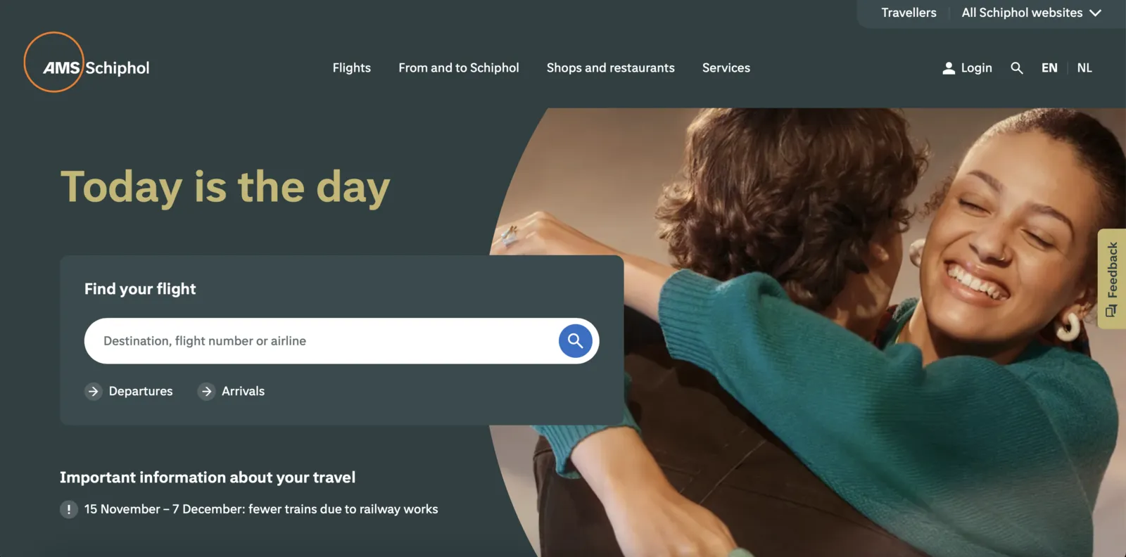
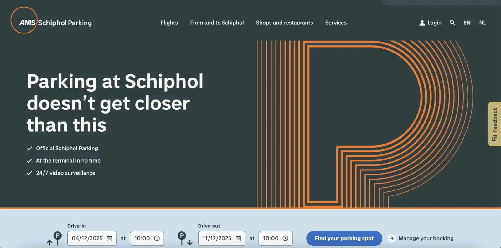
Creating a sense of quiet luxury in the communication of the Netherland’s busiest airport is not an easy feat. It requires large teams, big plans, and many, many subprojects within the project. In order to streamline the transition to the new visual brand identity, Schiphol’s online environments, the website, app and on-site kiosks, were the first ones to be transformed and formed the blueprint for everything else. Schiphol digital art director, Claudia Aio, and thonik art director Falco van Burg explain how they went to work.
Falco: “As we won the pitch, we wanted to start with the digital department – partially because the transition would take the most time, but also because this is where most people interact with Schiphol before and during their actual time at the airport.
The old and new identity were on opposite ends of a spectrum; the former being quite nondescript and very white, the latter being subdued, but very much out there. In order to get things right from the get-go, Claudia started working at thonik one day a week, and I went to Schiphol for the busiest periods.”