In September, the month immediately preceding the start of the Anniversary year, I had the opportunity to once again interview thonik’s Thomas Widdershoven, who worked on the integrated campaign and new identity. His answers could not have been more lucid.
When I visited Spiral with my partner Nikki Gonnissen in January of 2009, I first understood Spiral’s three types of activity. First creating a number of projects related to the Arts, then functioning as a space for developing artistic activities, and thirdly externally directed activities to promote these results. This is why what was important was not what design was to be presented but rather “the extent to which this was a space of activity” needed to be explored, through a common image. Widdershoven and Gonnissen had astutely grasped the potential of Spiral’s coherence of attitude and energy of place. And from this understanding they had searched for the most Spiral-appropriate activities of this consistent ‘integration of art and life’ from its birth in 1985 to the present day.
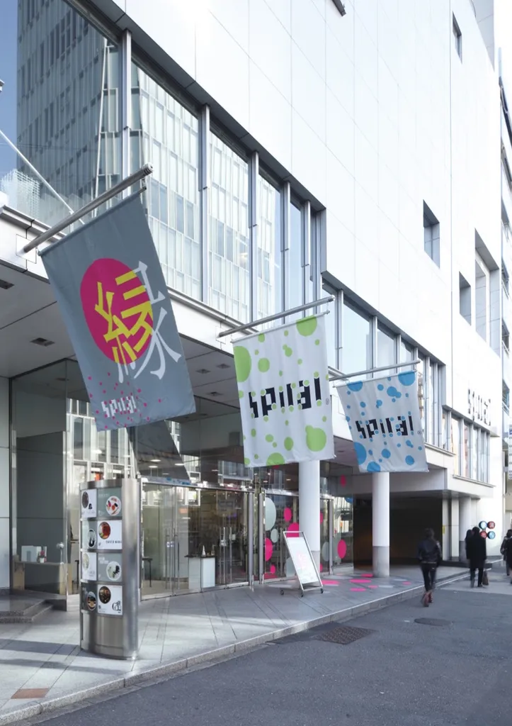
The first phase of preparation for the ‘en’ campaign which then developed, was to imagine a new identity logo for this anniversary year based on the beloved original graphic identity by Masatoshi Navajo. The key to the thonik proposal was ‘en’ (= circle). Obviously, the circle is a form deeply related to the Spiral concept, but fascinatingly their point of departure was to take the logo clasp af fixed to the exterior of the building. For this year, themed on the ‘en’ concept, they first sought to re-envision this familiar and important fixture, intuitively reinvesting our daily encounters with it. Spiral’s spirit, its 25 years of accomplishments, and therefore its continuing potential… each were multiplied in this gesture.
Then, in October of 2009, the ‘en’ campaign began: a formation of the circle, and of another ‘en’, that of relationships. ‘Towards the “next” unpredictable design’ was how thonik phrased it. In their native Dutch language, the conjunction ‘and’ is ‘en’. The campaign itself is a way of thinking, of generating new breadth and possibility.
And then there was another surprising development. I refer to the December 2009 thonik exhibition ‘en’, with its flags hung throughout Spiral’s interior, each a visualization of the various Chinese readings of the homonym ‘en’ (garden, party, charm, flame, performance, monkey, etc.). Only later did one realize the many recurrences of monkeys in those graphics. And they chose a monkey for their image character.