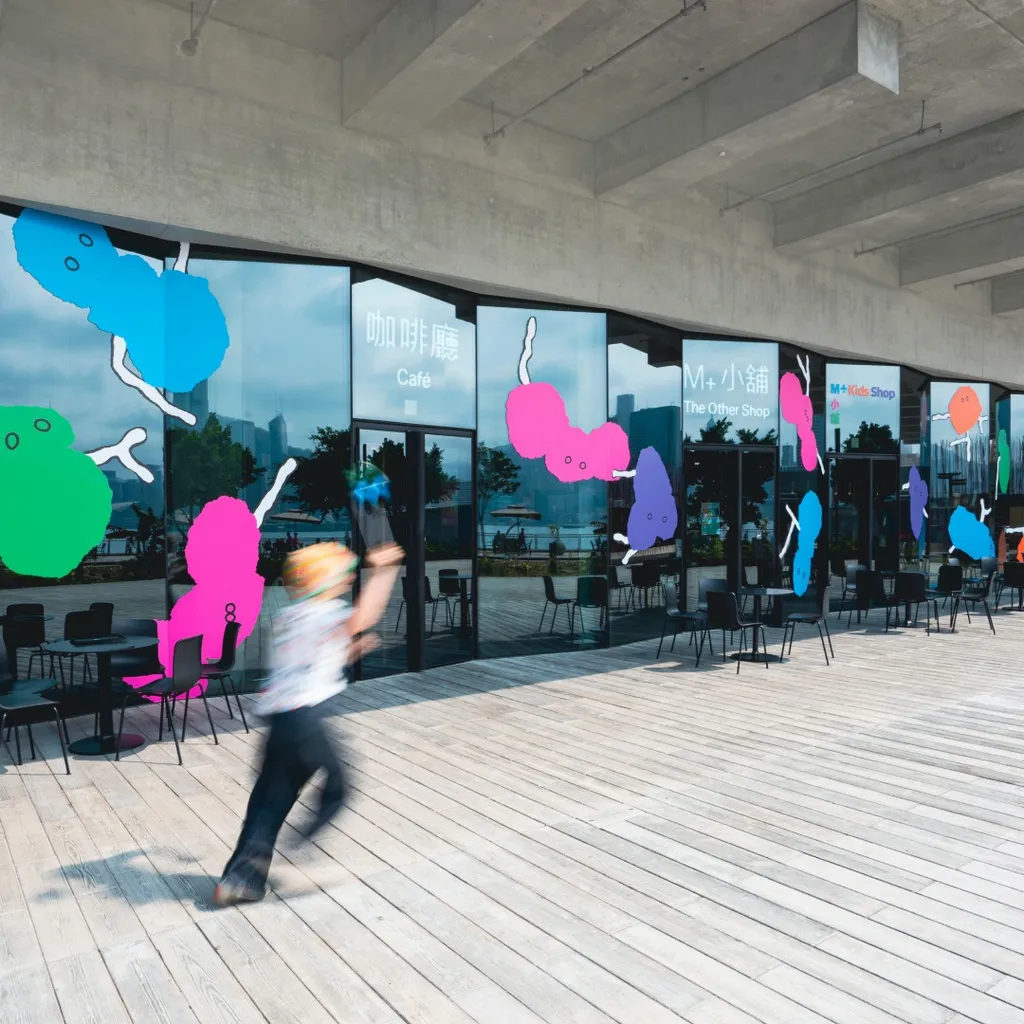
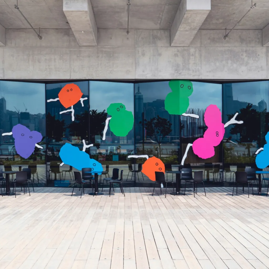
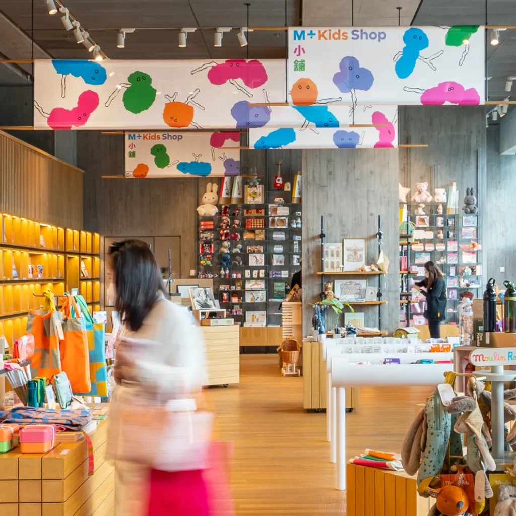
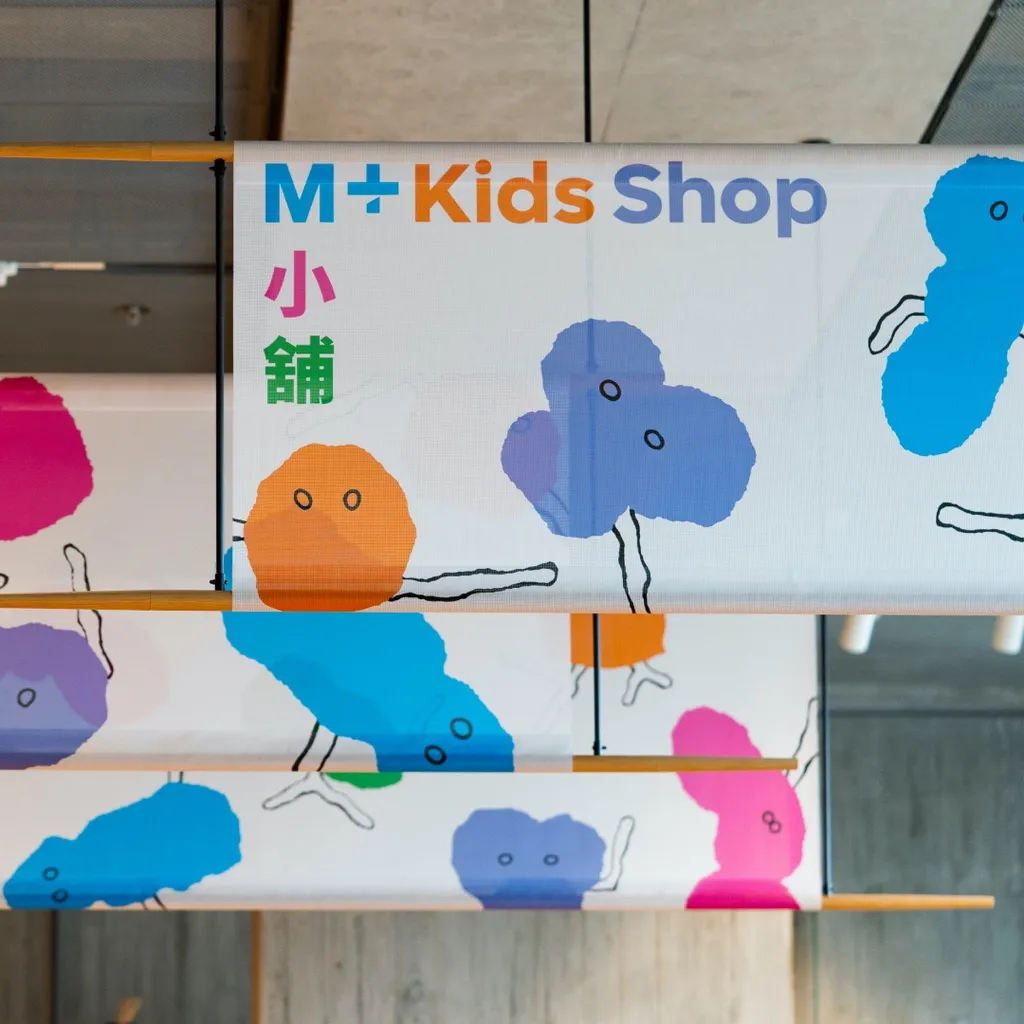
The visual identity of M+, the museum for visual culture in Hong Kong, centers around a unique color system. It starts with a mid-tone grey, to match the subtlety of the concrete of the building. In small steps this grey color transforms in light browns, mustard, a greyish rosé. The color range ends in vibrant orange, cyan blue, pink, lilac and green. The brighter colors reflect the neon commercial communication that typifies Hong Kong’s energetic street life.
For the M+ Kid’s Shop these brightest colors come alive in 5 cuddly creatures. They have Cantonese sounding names: Lannie (Blue 藍), Charny (Orange 橙), Zoey (Lilac 紫), Louis (Green 綠), Pheoby (Pink 粉).
