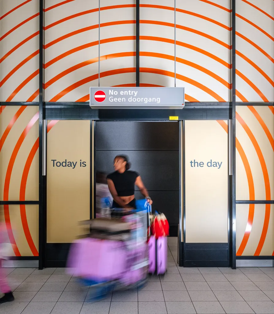
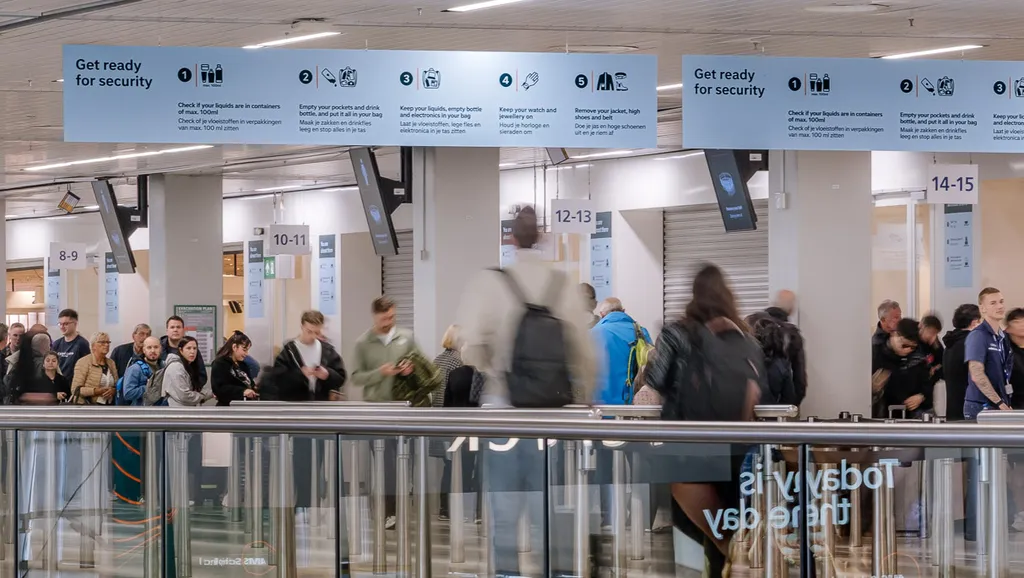
Over one year of work is now visible in the arrival halls, on the central buildings and in the communication in and around Schiphol Airport: an identity as a beacon of calm amid the many visual triggers at the airport. This would not have been possible without integrated collaboration between Schiphol's Executive Team, Eastwood Strategy, advertising agency Ace, and thonik. Nikki Gonnissen, our founder and creative director, and Roel Stavorinus, our strategy director, explain how and why.
Collaborating for a better passenger experience at Schiphol
Schiphol Airport

‘Schiphol is a source of national pride,’ explains Roel, ‘but it was no longer seen as a place where you want to be.’ The positive passenger experience at Schiphol had been declining for a number of years. To turn the tide, Schiphol decided in 2024 to return to the spirit of 1967: the year in which the airport was revolutionarily designed by a diverse and multidisciplinary team, consisting at the time of architect Marius Duintjer, graphic designer Benno Wassing, and interior designer Kho Liang Ie.
In 2024, that team consisted of Schiphol's Executive Team, advertising agency Ace, Eastwood Brand Strategy and thonik. Together, we developed a new brand promise: Schiphol is a safe haven for world travellers. ‘We want to bring peace to an environment that is stressful for many people. The brand must help us grow step by step back to the top three airports in Europe,” says Schiphol CCO Arthur Reijnhart. With this first step, we are working on a place where you can move smoothly from app to gate. Where you come home to a place where you can also relax. Safe, familiar and relaxed.
The entire process to get there will take five years and starts with a new graphic identity, designed by thonik, in close collaboration with Schiphol itself. Nikki: "To develop a new image for the airport, we started with all the people and parties who help determine how the airport looks and feels today. By sitting down with all the brands, sub-brands, players and stakeholders at and around the airport, we were able to start an iterative and interactive design process that focused on the passenger experience."
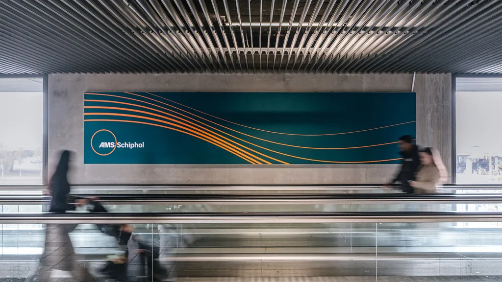
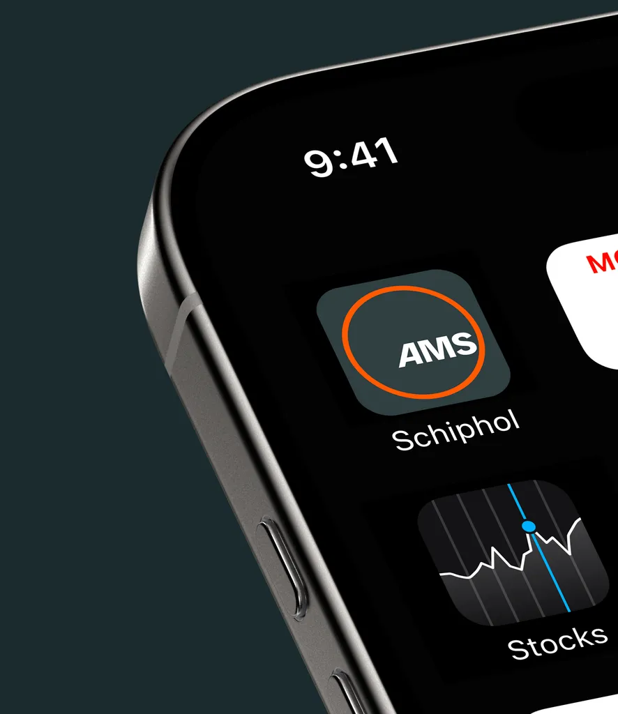
This design process has resulted in a new visual identity that radiates calm. With a subdued colour palette, a hint of our national colour in the form of orange lines, and a logo that symbolises both the world and a safe haven, with Amsterdam's IATA code (AMS) in the centre.


The logo and all other texts are written in RSG Variable (Royal Schiphol Group Variable), a font developed especially for Schiphol, of which the variations of which can be used for all texts at the airport: commercial and informative, by Schiphol itself and by partner organisations such as Schiphol Parking, Schiphol Media, or Schiphol Real Estate. ‘This makes the journey a lot more relaxing,’ explains Sander Hengeveld, Head of Brand at Schiphol. ‘Travelling becomes easier when all touchpoints are aligned.’
This would never have been possible without cooperation between all parties within Schiphol. They now all share their font and colour palette, which is inspired by Dutch nature. It is this unity that makes Schiphol's new identity so striking. Nikki: ‘This is how we show that you don't have to shout to be heard (or seen).’
