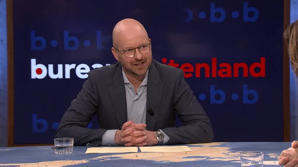
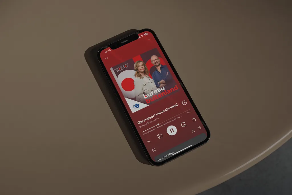
A great radio show does not always make great television. Bureau Buitenland, however, does. Against the backdrop of a chaotic geopolitical arena, the radio show, that celebrated its 10th anniversary last year, is now making its debut on television. As of April 2025, Bureau Buitenland is not only a daily radio show, but also a weekly talk show that invites the West to look around: how are geopolitical power dynamics shifting? With its two presenters, Sophie Derkzen and Tim de Wit taking place in a television studio, connecting to a way broader audience, Bureau Buitenland needed a new visual identity.
Making sense of geopolitics
Bureau Buitenland debuts on Dutch tv

That identity was meant to link the show to its broadcaster, VPRO, and that had to be translated to everything Bureau Buitenland needs to communicate.
Therefore, we distilled the two dots in the ‘p’ and the ‘o’ in the VPRO logo, and used them to fill the two lowercase b’s of the logo of ‘Bureau Buitenland’. In motion design the two dots symbolise eyes to see the world with, but also ping pong balls that bounce around as politics shift. Using a similar style of motion design, the two dots are clearly recognisable as the dots the audience already knows – from the VPRO idents.
The two dots of the logo are animated into social stories, instagram posts and the animations featured in the studio. They highlight the topics mentioned by presenters Sophie and Tim and are used to introduce their guests. All in all, they unite the presenters in the studio with the audience that watches them online and on TV, follows them on social media and tunes in with them on the radio – the visual identity Bureau Buitenland deserves and needs in order to move into its new, visual era. Just in time as the world moves towards a new era, too.
