by Thomas Widdershoven
We got to know Ms. Kato, Mr. Kobayashi and Mr. Okada when we visited Spiral in january 2009. During the meeting we not only discussed an exhibition of thonik in Spiral, but also an assignment. In 2010 Spiral would celebrate its 25th Anniversary and they wanted a logo for that. Or maybe they wanted a new logo all together, ready for the next 25 years. A logo that would express Spiral’s new energy and expansion: more and more activities outside of the building.
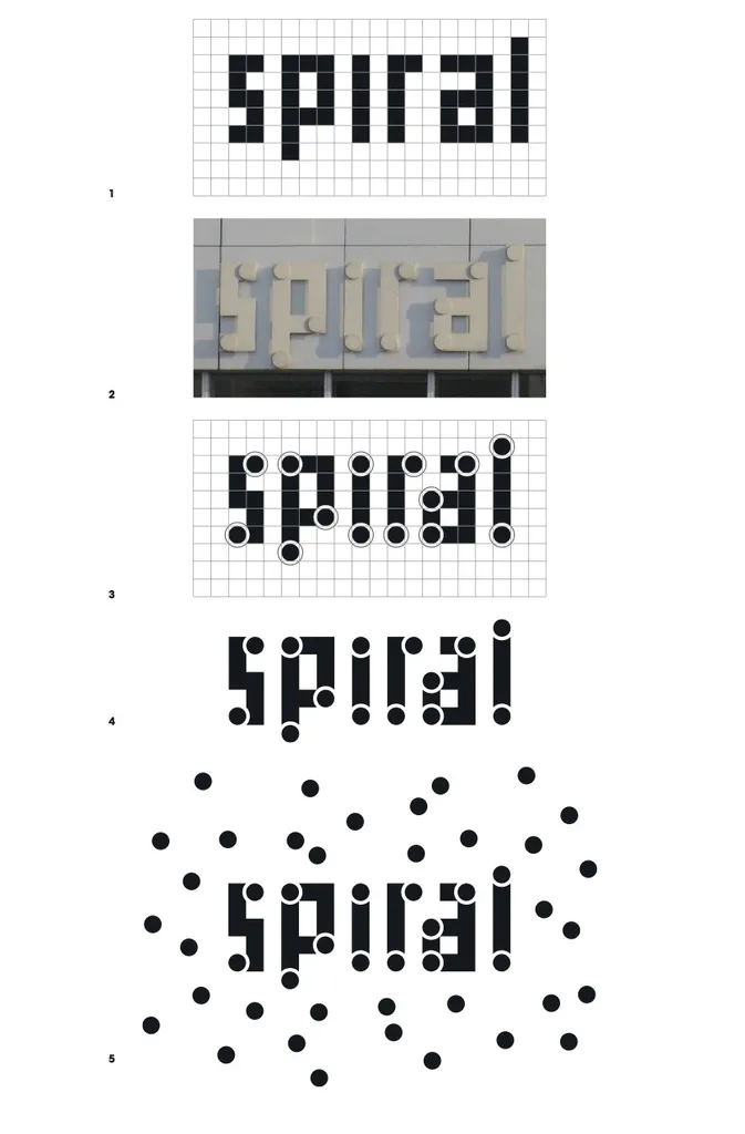
The Spiral logo was designed by Masayoshi Nakajo (pict 1). It is a typical eighties design in an international style, so it was not hard for us to relate to it. We looked at the many uses of the logo in the building, but were most intrigued by the display on the façade. Here the square type was attached to the building by big round dots. Though it did not seem to contain much logic as to where the dots were placed (pict 2).
We assured our clients that whatever the result of our proposal, the image on the façade would stay the same. In April Ms. Kato, Mr. Kobayashi and Mr. Okada would come to Amsterdam to hear our proposal. To start on the project we meticulously copied the circles of the façade type into the logo design by Mr. Nakajo. We thought the circles reflected the architecture of the Spiral Building: an angular building with a round heart where a spiral ling ramp leads from the rest to the second floor.
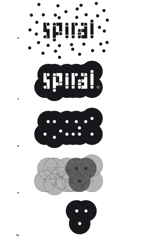
We found that the spacing in the old logo was a bit odd: between the ‘a’ and the ‘r’ there was more space than between the other letters. We solved this by making the upperpart of the ‘a’ a square shorter, so the ‘r’ t better. The ‘r’ thus ‘connects’, as it were, to the ‘a’. This is called a ligature in typography. From there we looked for the ideal way to incorporate the circles in the logo. The simplest way proved to be the most effective: a circle fitting exactly in the square, and around that a white outline, which exactly circumvents the square (pict 3). This is the new logo, very 2010: happy, open, energetic and self-conscious (pict 4). When we proposed this new design in april, it was welcomed by the Spiral staff.

