Shaping the identity of an international performing arts festival
Holland Festival
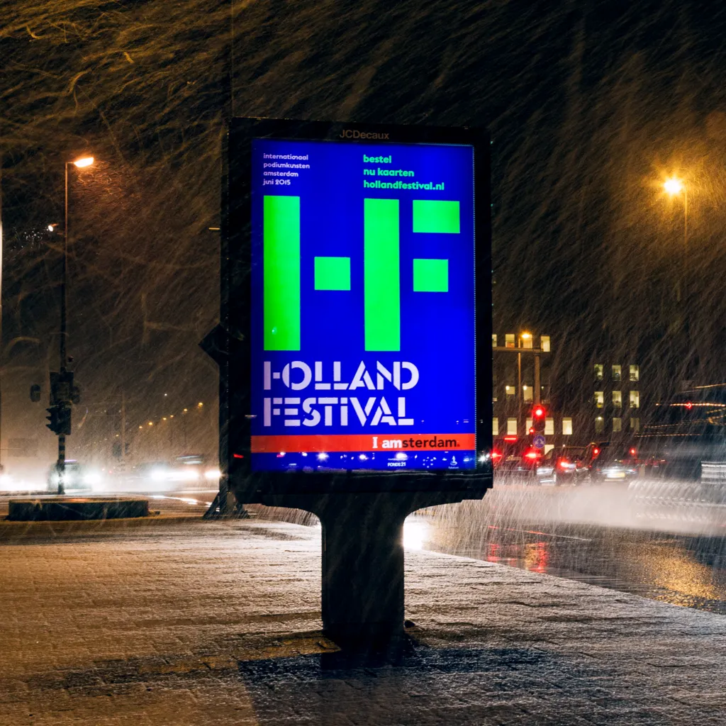
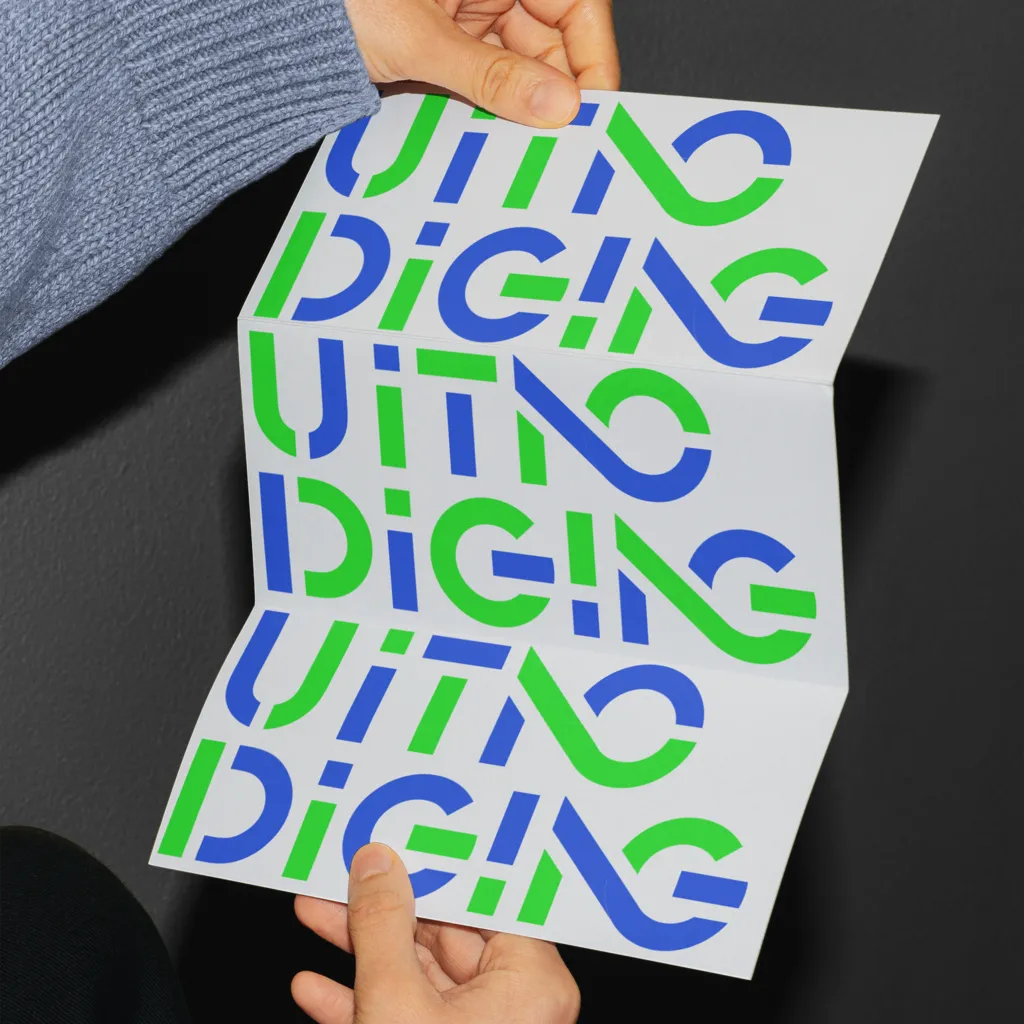
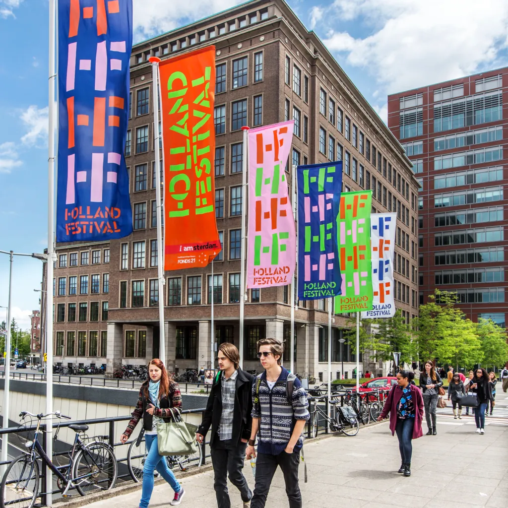
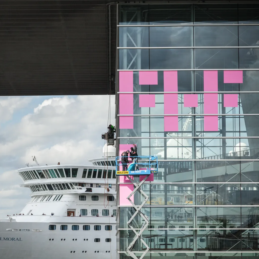
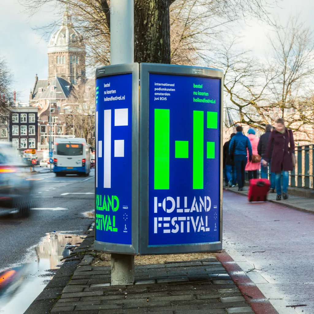
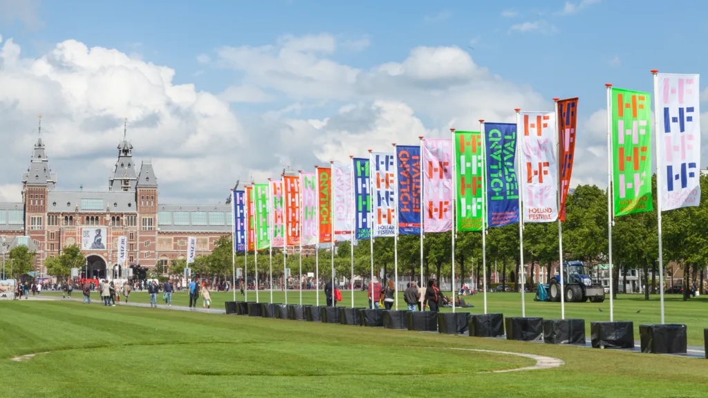
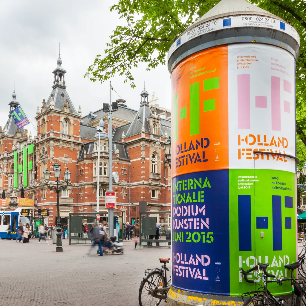
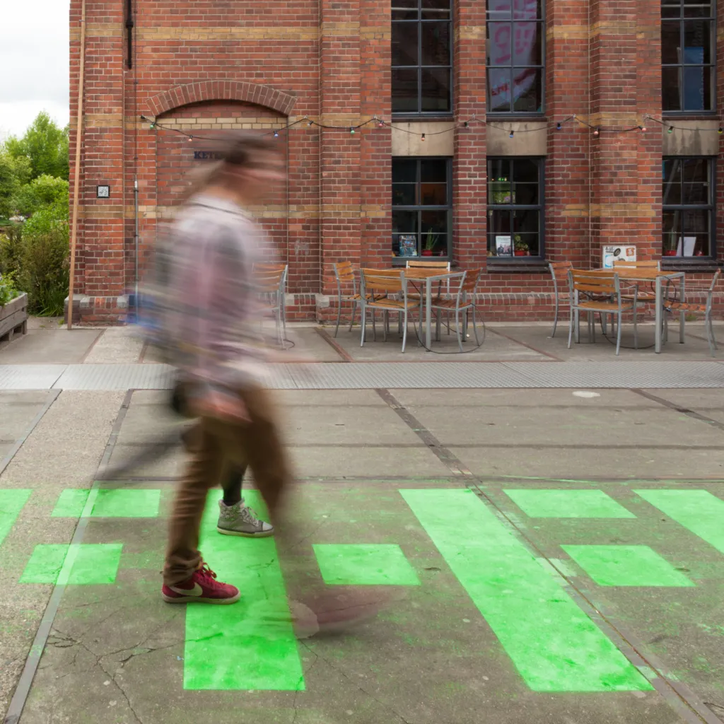
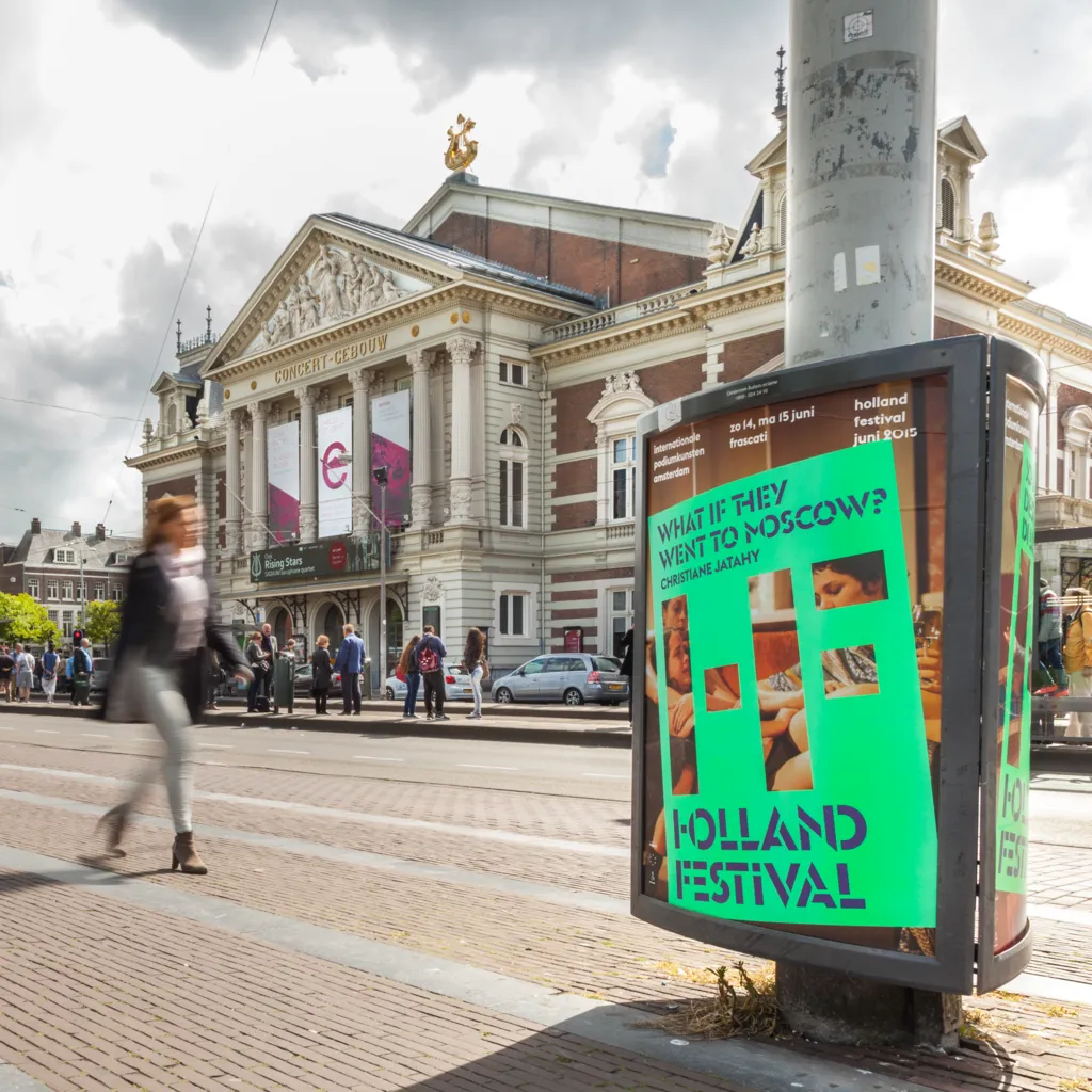
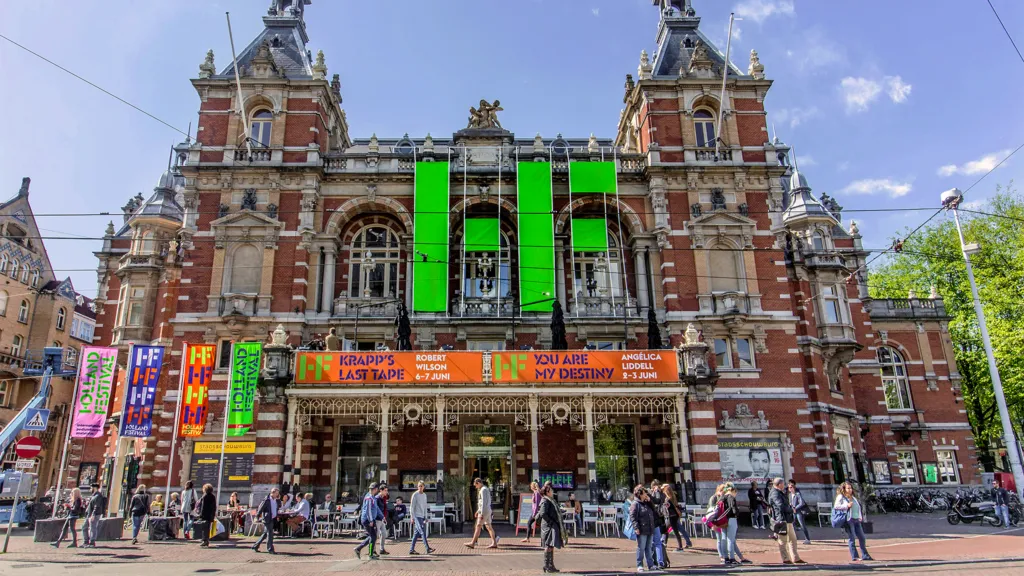
We contributed to the evolution of the visual identity of the Holland Festival for nine editions since 2015. A dynamic identity built on a system of stencil letters and ligatures, respecting the festival's esteemed heritage in Dutch graphic design while adapting to its ever-evolving artistic direction.
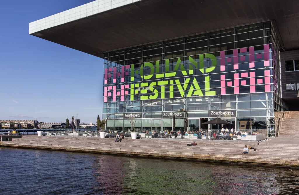

stencil letters and ligatures
The design process involved creating a bespoke typeface in collaboration with font foundry Bold Monday, starting with the Swiss typeface Euclid Flex and incorporating elements from Milton Glaser’s 1970 stencil. This approach allowed us to craft a graphic language that was instantly recognisable, open, and international.

Collaborations
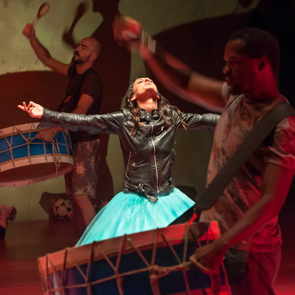
Photography
Maurice Boyer, Thijs de Lange and Ada Nieuwendijk